
Oxygen
Challenging the status quo in banking
Oxygen is the US banking platform designed for the freelance community, empowering talent to focus on their vision, rather than being restricted by complicated sign-up processes, expensive fees and unnecessary paperwork.
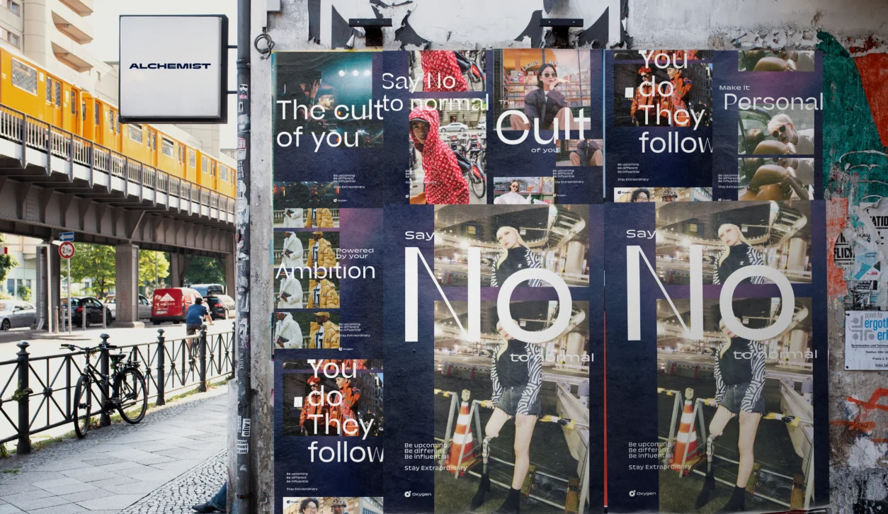
Working together with the Oxygen team, we drilled down into their target audience, crafting a lifestyle brand tailored for creatives and visionaries. This transformation redefines Oxygen as the ‘Hypebeast’ of banking.
This unmistakable hook spanned all brand interactions, from the physical card, to marketing campaigns and all creative collaborations. This strategic approach aims to defy convention, allowing Oxygen to distinguish itself within the busy fintech sector.
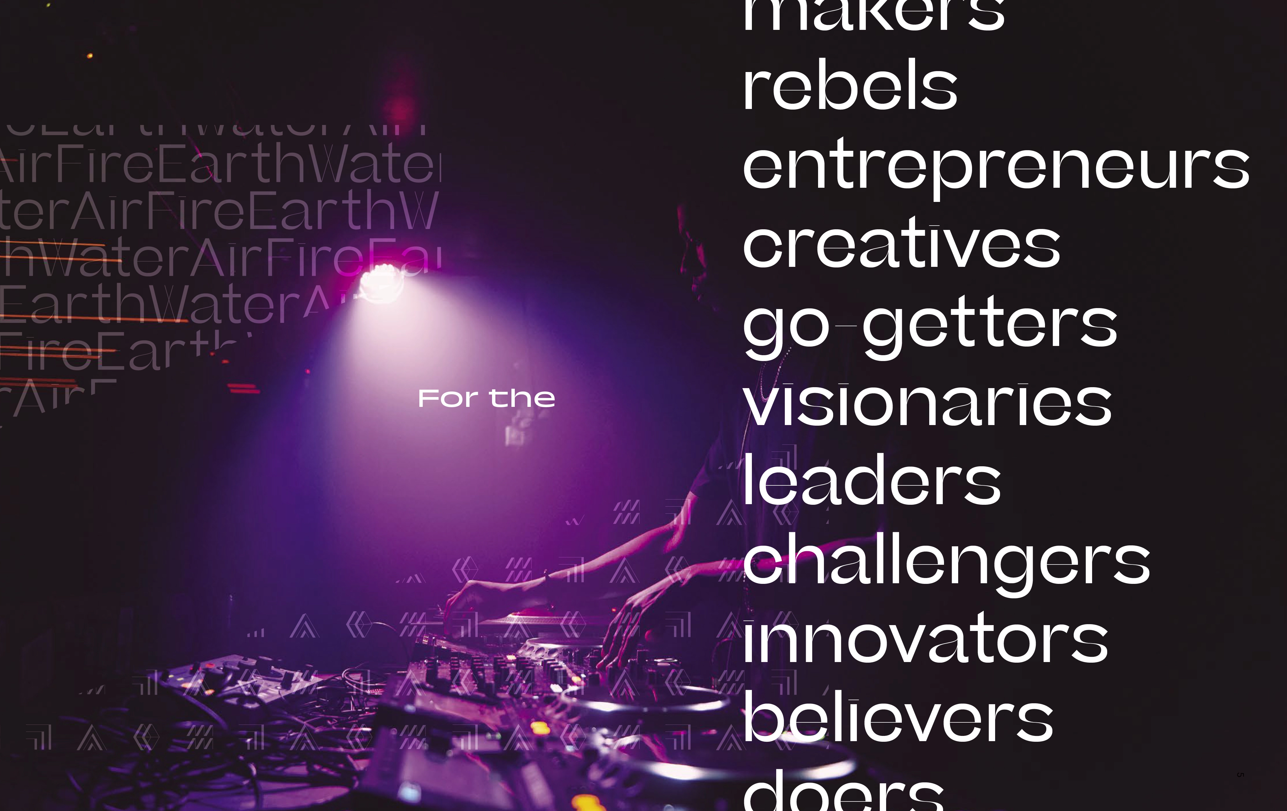
By employing dynamic graphics, high-fashion imagery, and an audacious attitude towards banking, our objective was to resonate with creative individuals who lead extraordinary lives and drive cultural change. That’s precisely why we embraced ‘no to normal’ in everything crafted for Oxygen.
This commitment ensures that Oxygen and its partners:
Stay Extraordinary®.
Scope
Brand strategy
Brand identity
Brand implementation
Verbal identity
Card designs
Packaging
Iconography
Publication
Marketing materials
Digital direction

Logo
We worked directly with type foundry, Sharp Type, to create a custom weight of the font Trois Mille for the Oxygen logotype. Designed to fit perfectly alongside the new Oxygen icon.

Element level icon system
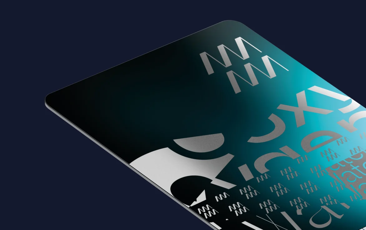
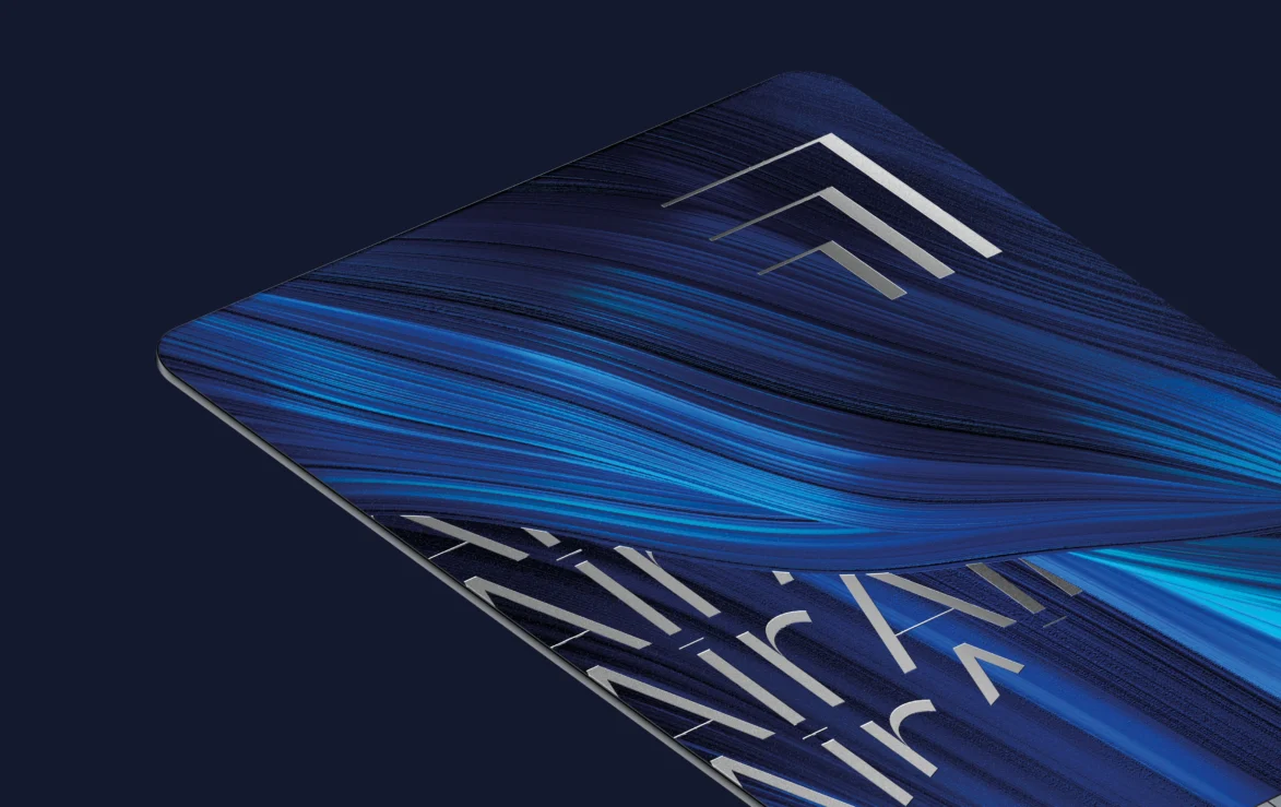
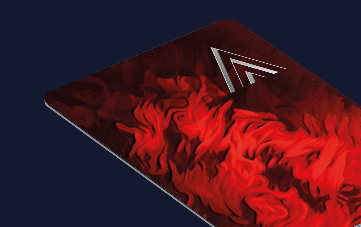
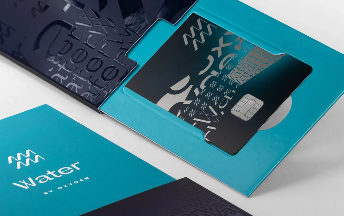
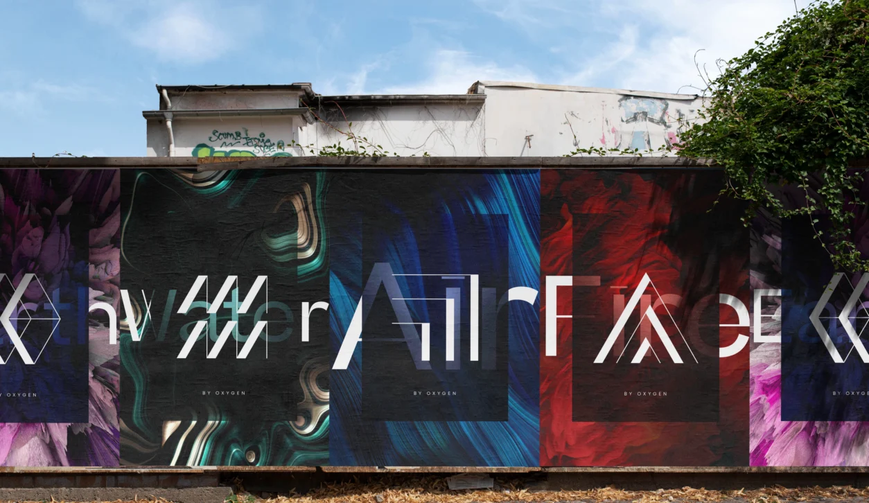
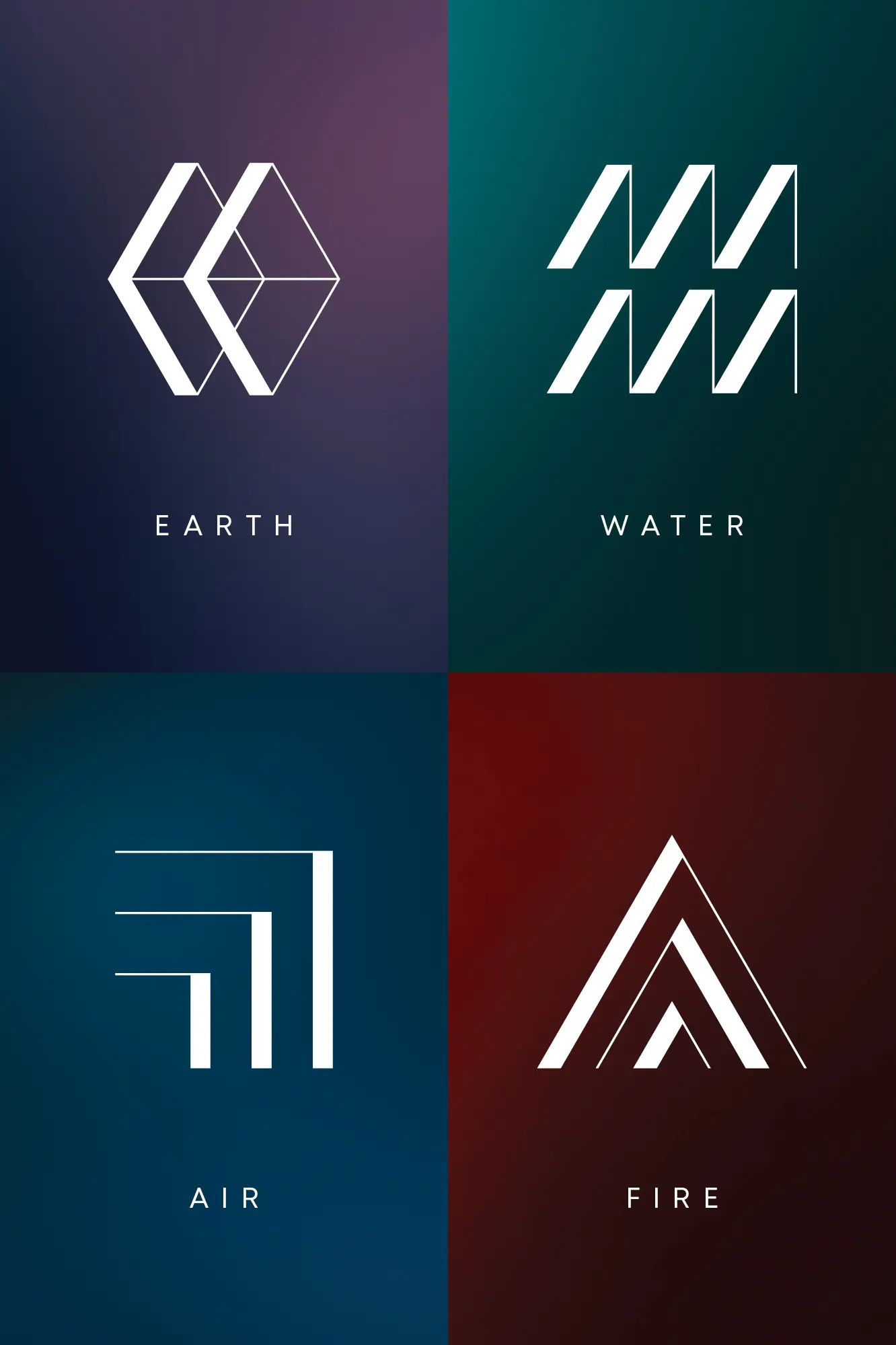
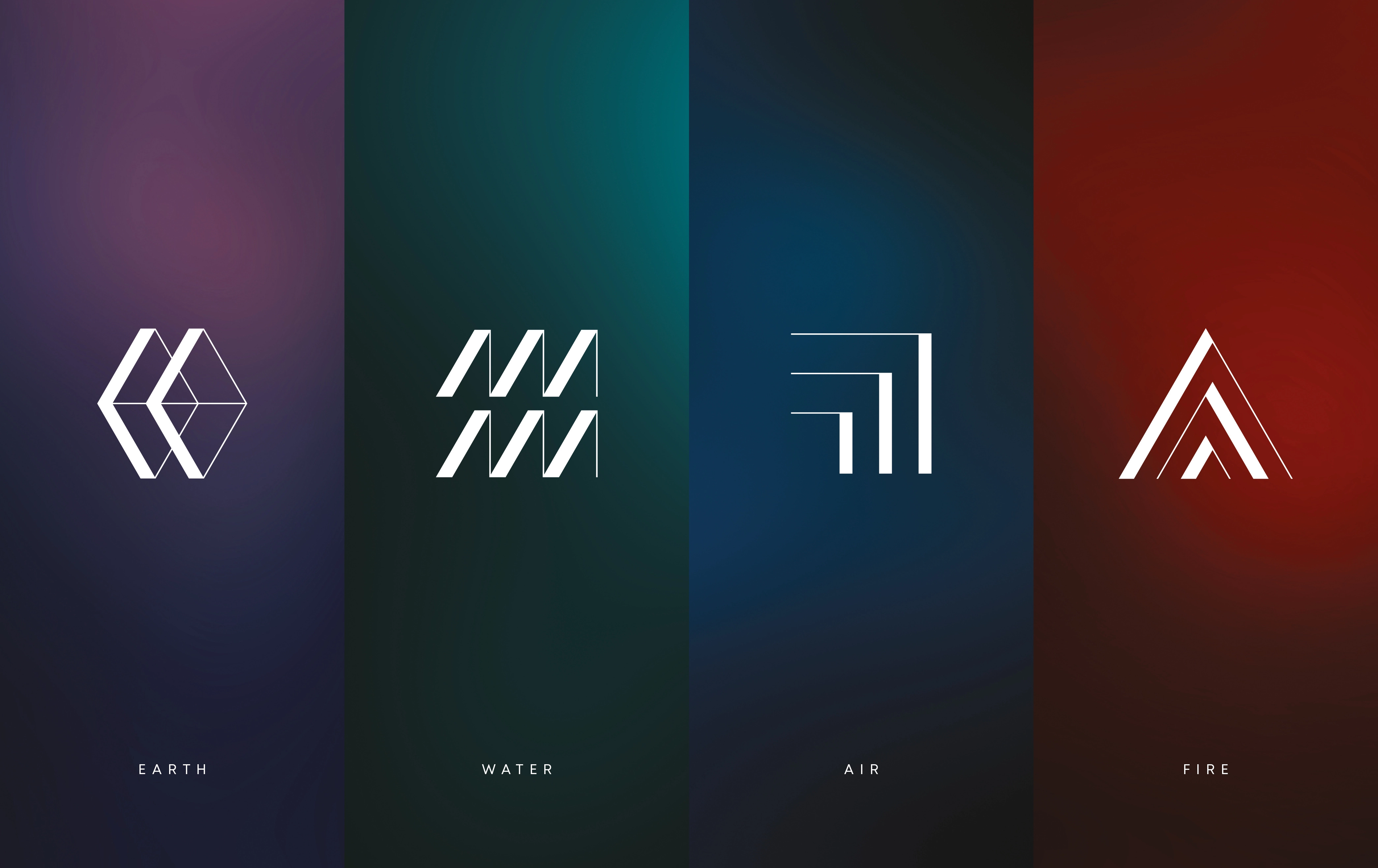
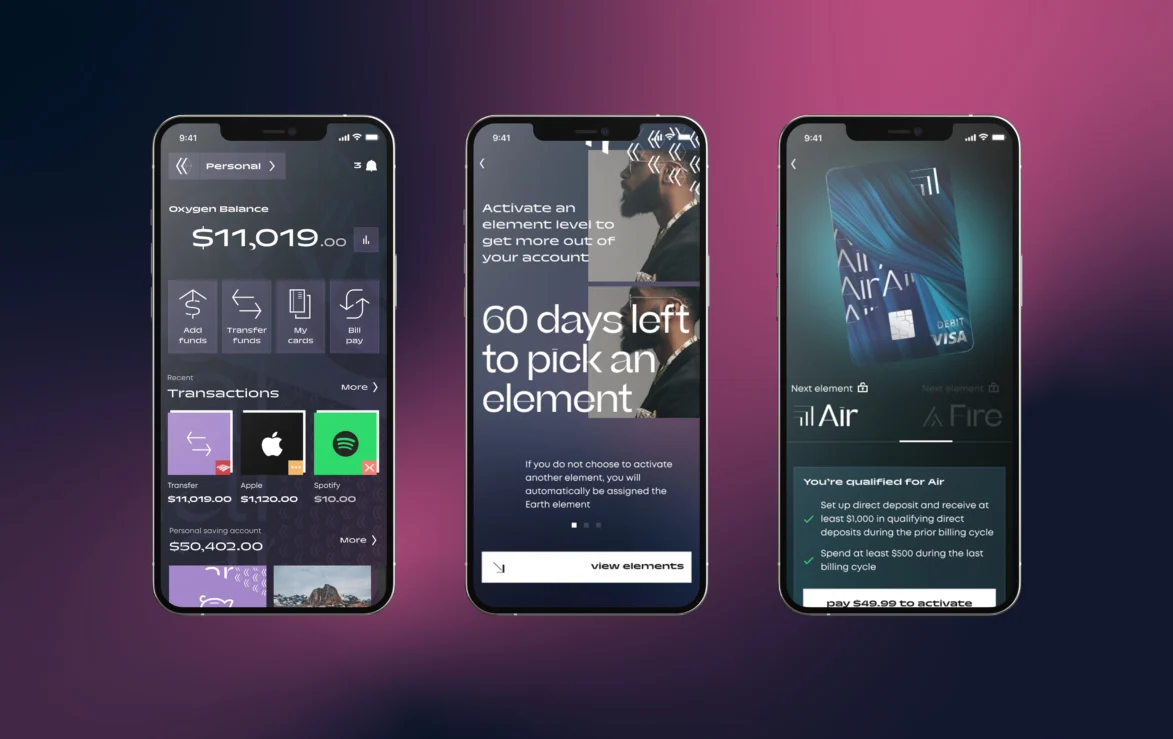
Icons were incorporated into the branding to delineate the various levels within the bank. These open up different lifestyle benefits, financial tools and exciting rewards with each level. Using a high-fashion aesthetic, they symbolise the elements Earth, Water, Air, and Fire, becoming a distinctive part of the identity.
Dynamic graphics framework
We created a dynamic framework integrating the icon, logo, and Element-level icons. It unlocks endless graphic possibilities, whilst giving Oxygen a strong and unique visual direction.

Photography. Creative aspiration.
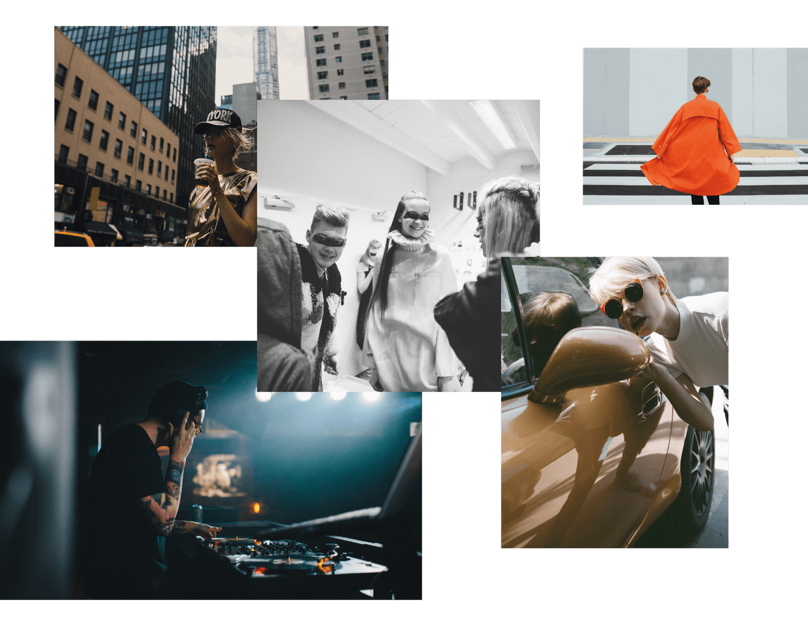
The creative direction for the photography is all about inclusivity and self-expression. Creative people in real situations, doing what they love.

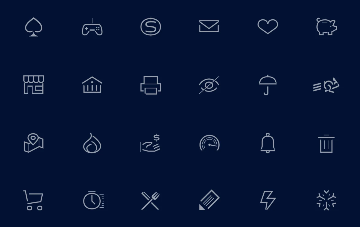
Icon suite
To make sure the Oxygen app was an intuitive and functional experience, we developed a comprehensive suite of over 300 icons, categorised into functional and explanatory sets. Each icon is meticulously crafted in 16, 24, and 40 pixel formats, catering to various digital display resolutions and formats. The design is inspired by key characteristics from the Trois Mille brand typeface.


Card packaging
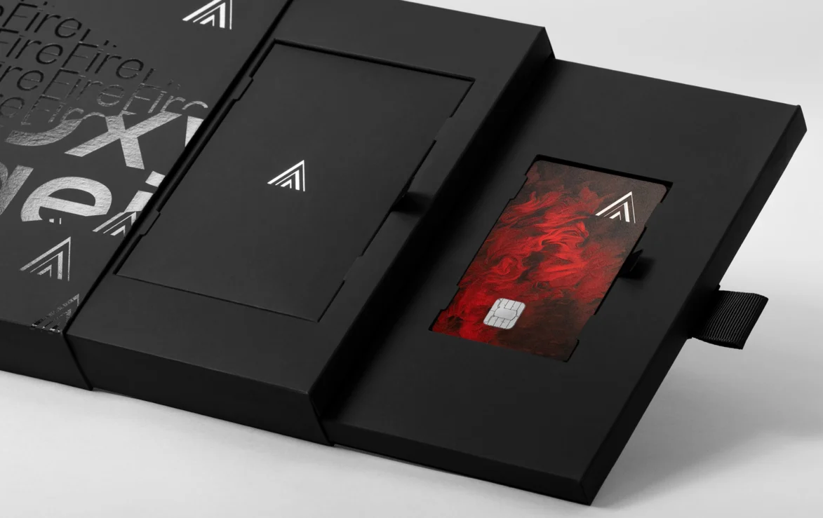
After the card itself, the packaging is the key physical touchpoint with Oxygen users. We took the Burgopak packaging system for the first 3 cards, Earth, Water and Air, and created a bespoke version for the highest level card, Fire, which features a multi-drawer system and limited edition set of prints.
Fashion-forward execution
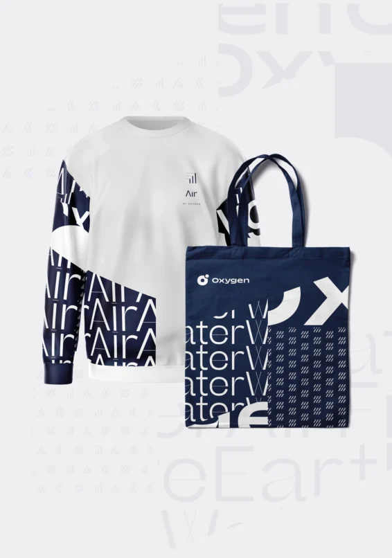
From swag to campaigns, the brand consistently sets itself apart from the crowd, fully embracing the Oxygen ethos: Stay Extraordinary.
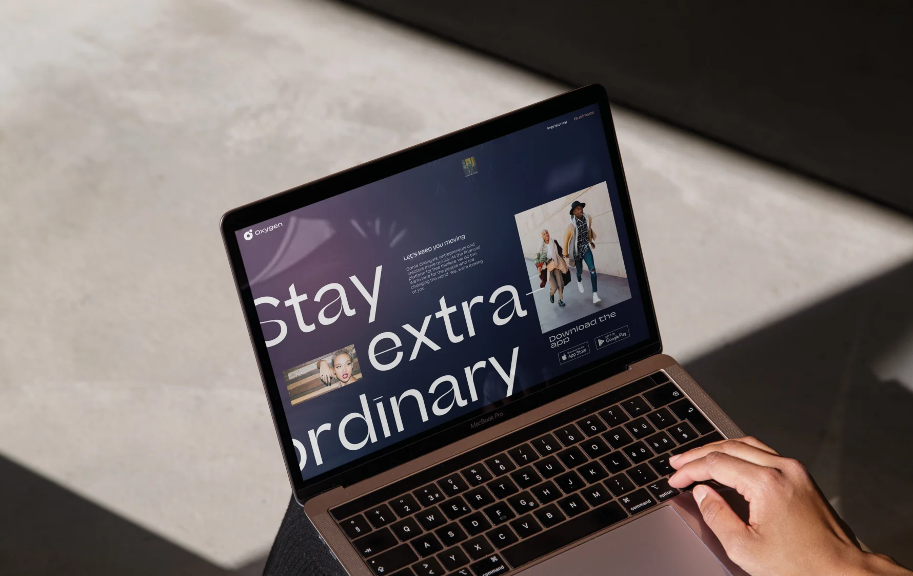
Digital partnerships
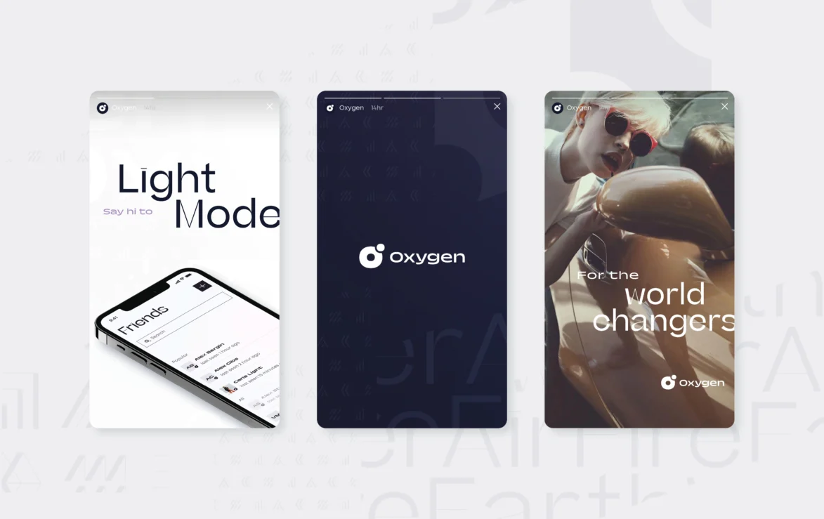
We worked as the creative lead across all digital touchpoints, locking in brand consistency while working with the social, app and web teams.


Levelling up with lenticular
Introducing the audience to each level of Oxygen banking, we worked with Hive Associates to create state-of-the-art 3D lenticulars.


It’s as if they delved into my mind and unearthed my unspoken thoughts! From shaping our strategy to meticulously designing the cards, the Planning Unit team delivered exceptional results even amidst intense time constraints and business expansion.
Team & Collaborators:
Hussein, Sani & Rae – Oxygen
Burgopack – Card packaging
CompoSecure – Metal card production
Tag Systems – Plastic card production
House of Words – Verbal language
Humbleteam – App build
Green Chameleon – Website design

