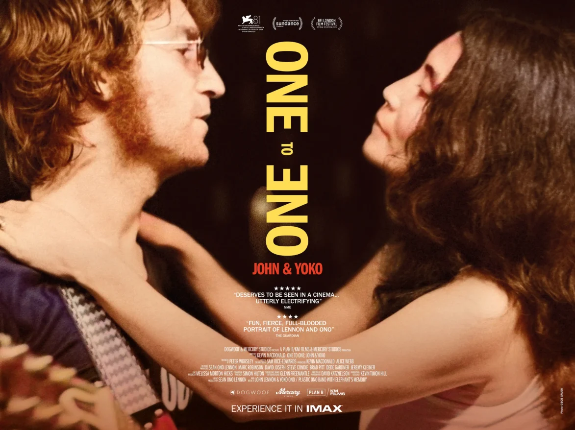
One to One: John & Yoko
A cinematic look at the couple’s formative years in New York
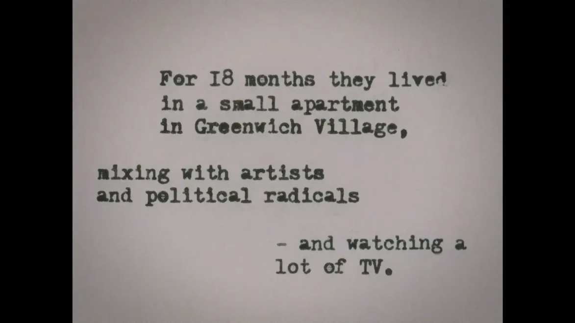
One to One: John & Yoko is a documentary film co-directed by Kevin Macdonald and Sam Rice-Edwards that chronicles the period John Lennon and Yoko Ono spent living in a Greenwich Village apartment.
We were brought on by the film’s director Kevin Macdonald to work on a wide range of visuals featured throughout the film. Everything from the titles and film posters to other in-film graphics – including phone calls, Jonas Mekas captions, and period correct graphics.
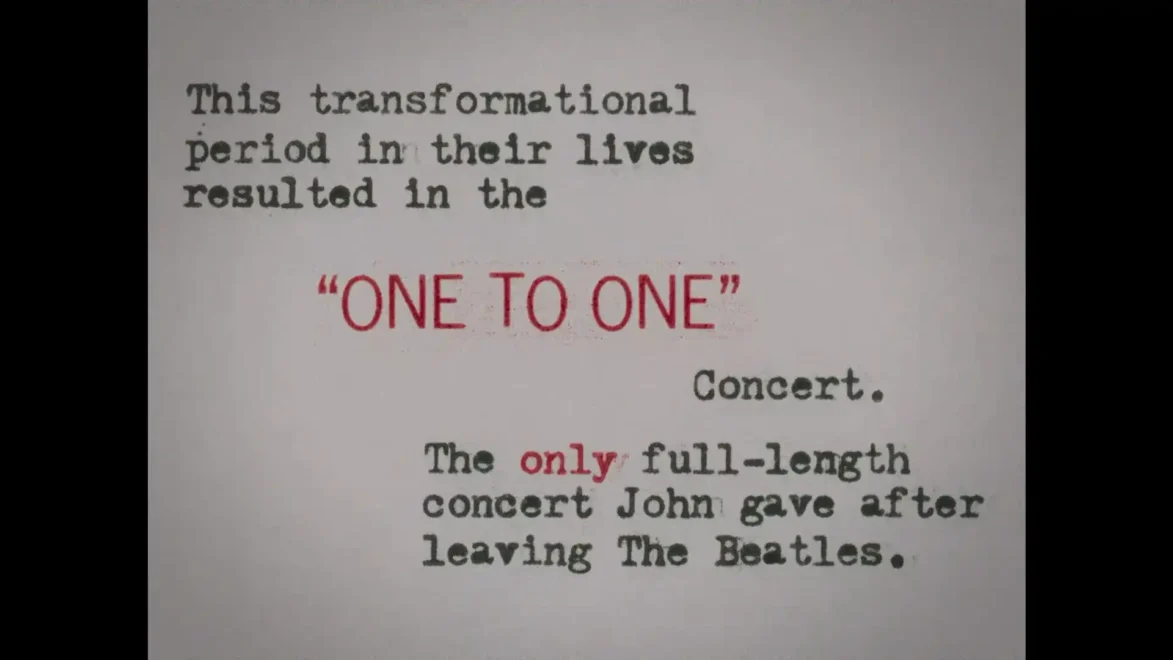
Set during a time of political and social unrest in America, the film explores the couple’s personal, artistic, and political responses to the upheaval surrounding them. It also features rare footage of Lennon’s only full-length solo performances after The Beatles, newly remastered by their son, Sean Ono Lennon.
Scope
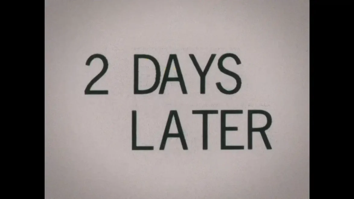
Film titles
In-film graphics
Animation
Poster design
One to One trailer
One to One: John & Yoko was released in the UK & Ireland exclusively in IMAX and general release in cinemas.
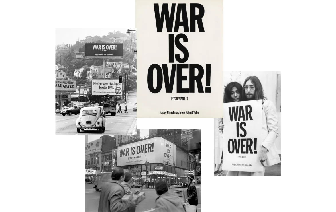
WAR IS OVER!
The typeface used throughout the film is Franklin Gothic – the same font used on Lennon and Ono’s famous 1969 War is Over poster.
Phone calls
During the making of the film, director Kevin Macdonald received hours of never-before-heard phone calls that Lennon and Ono recorded in the early 1970s – the couple assumed their calls were being bugged by the US authorities and wanted their own record of what had been said. These ended up being one of the main graphic narratives of the film.
The phone calls were the main use of Franklin Gothic, visuals are animated word for word, “like a game of Pong” and individuals are colour-coded for clarity – Lennon is yellow, like the famous submarine.
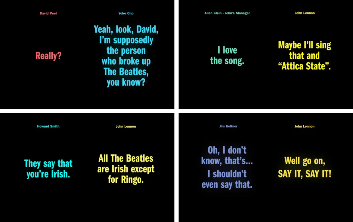
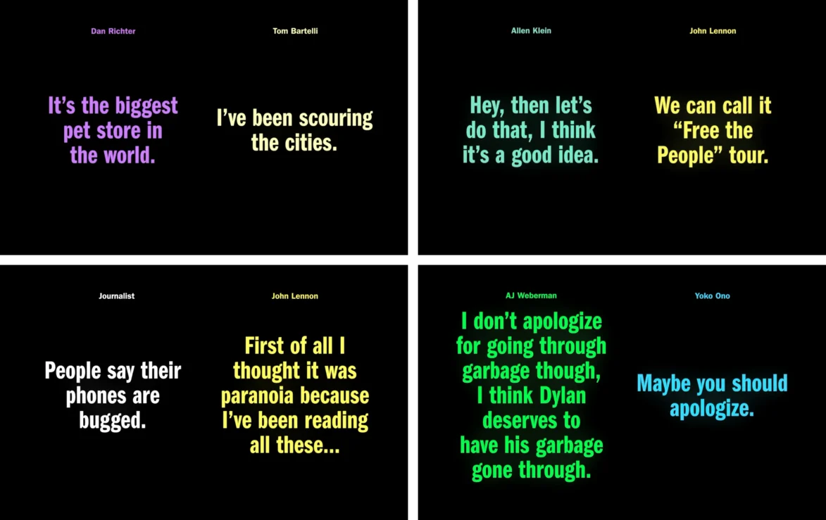
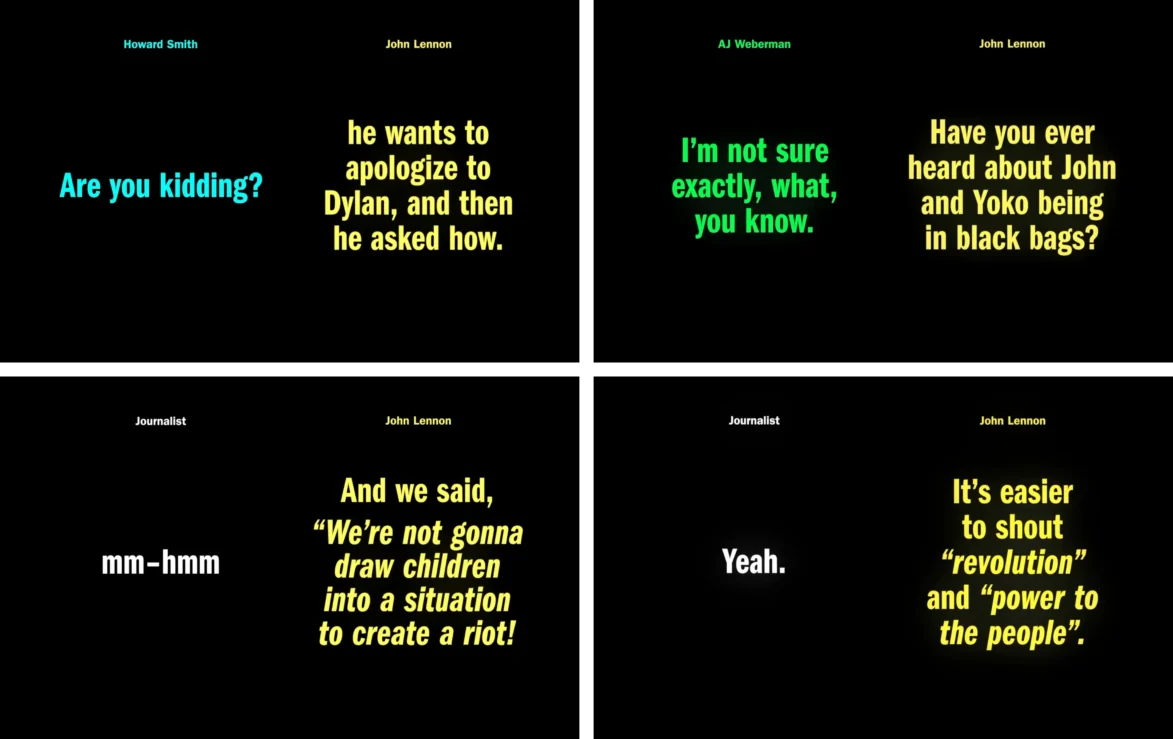
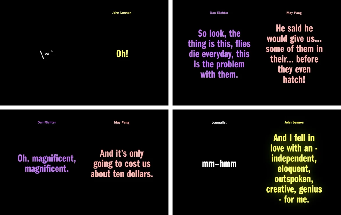
The use of Franklin Gothic anchors it beautifully, the subtle colour palette placing us firmly in the ’70s. The clean and simple animation of the text serves the narrative perfectly, helping the audience better understand and distinguish between the conversationalists. The clever punctuation marks to represent noises on the telephone lines playfully tapped the listening glass on the fourth wall.
Jonas Mekas captions
Jonas Mekas, a Lithuanian-American filmmaker, poet, and artist who has been called “the godfather of American avant-garde cinema”.
He was a close collaborator of Lennon and Ono’s. Mekas created captions for his films by typing sentences onto paper, sticking them to a wall and filming them.
The director Kevin Macdonald wanted to use the same style of caption to help contextualise the narrative and archive footage.
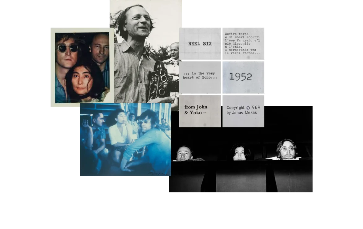
To create the Mekas’ captions we used the typewriter from the reconstruction of Lennon and Ono’s flat used in the film.
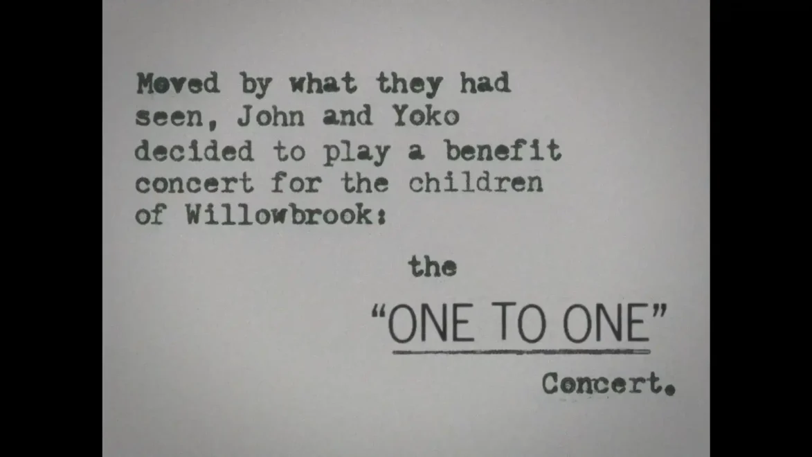
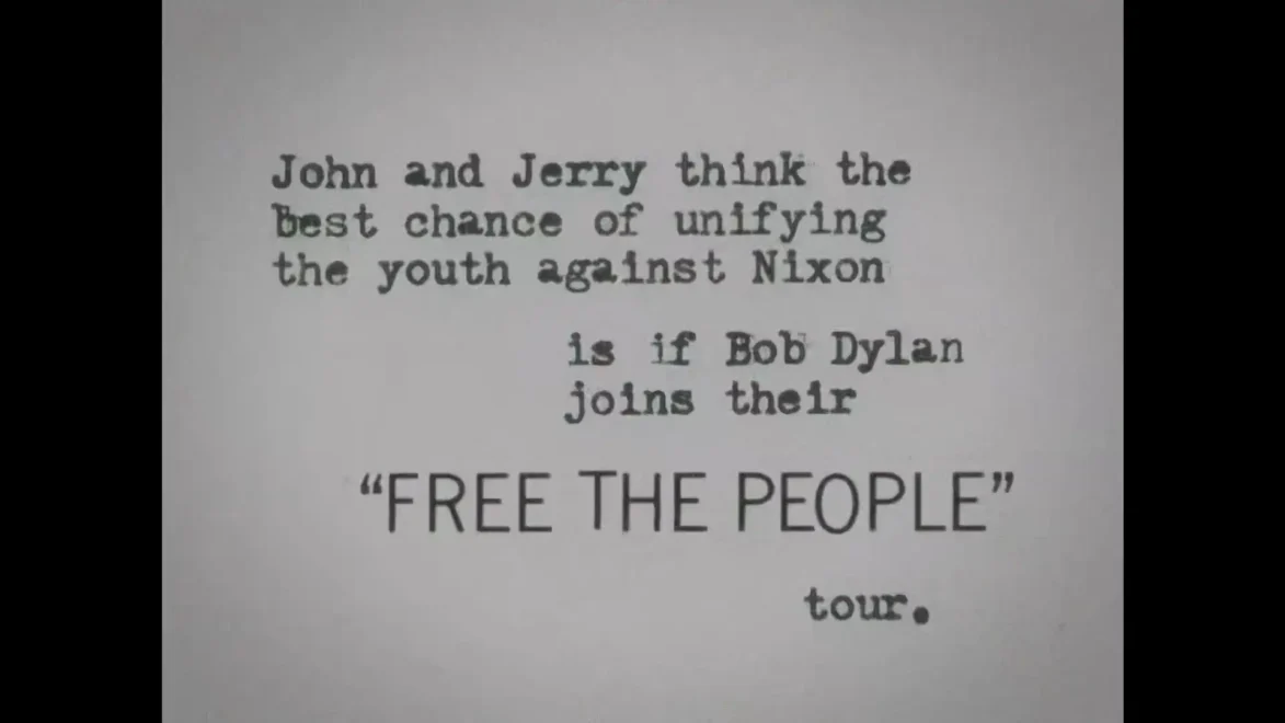
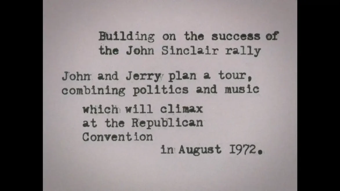
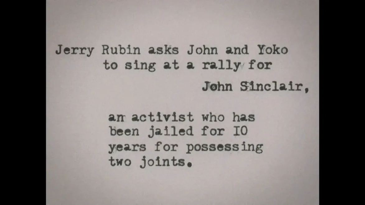
There’s something very homemade about those poorly-typed captions, and it spoke to me about that period and its lack of pretentiousness.
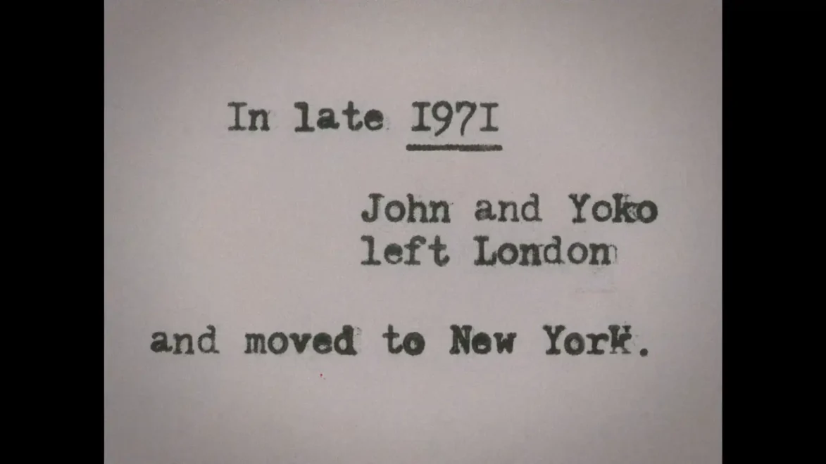
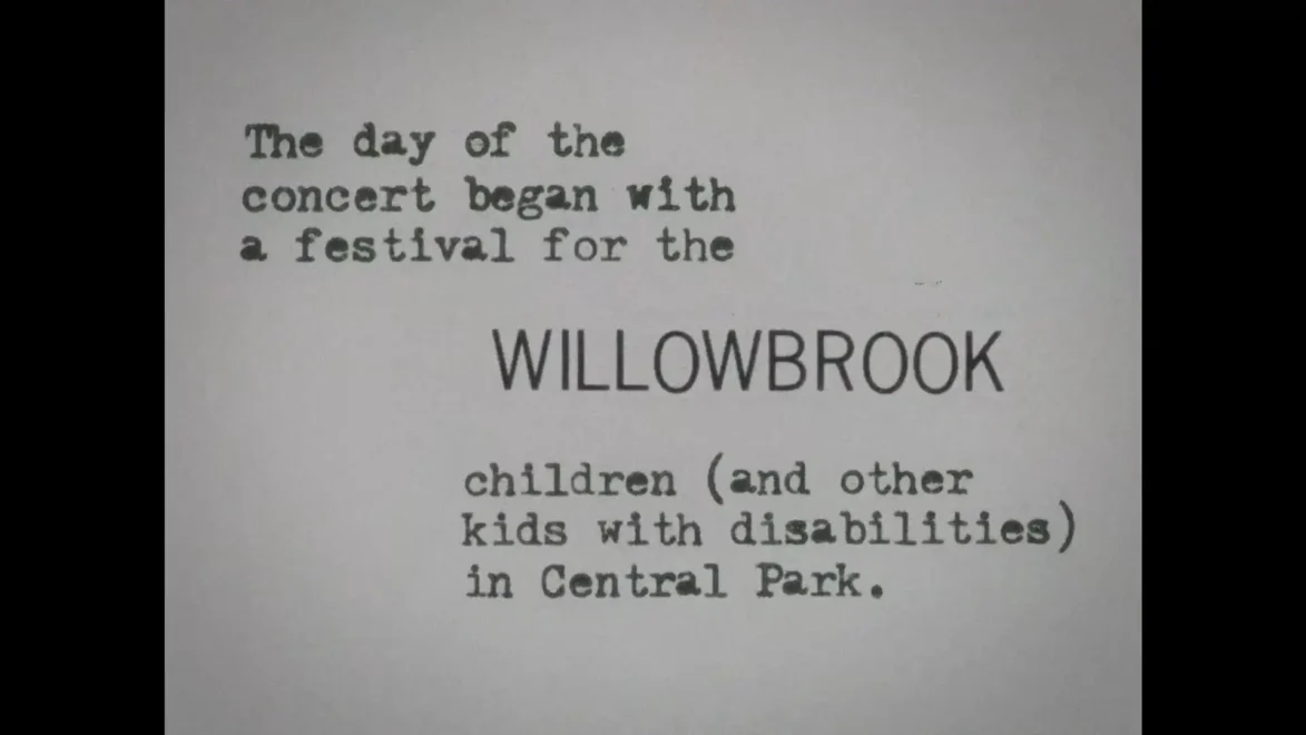
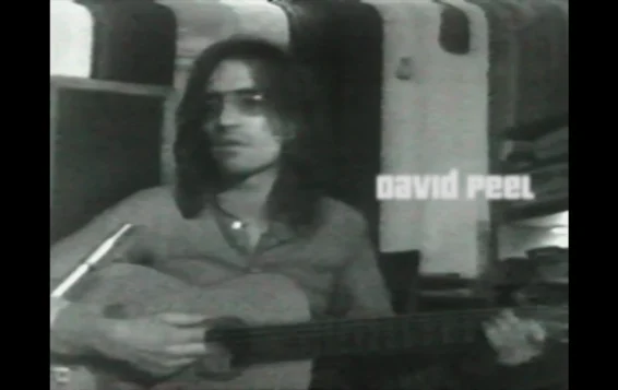
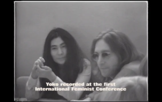
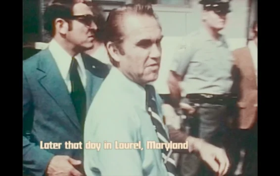
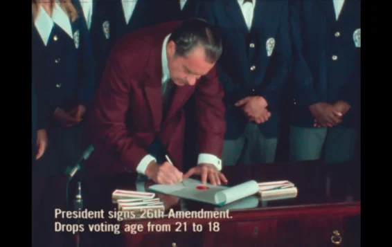
70s style graphics
The film, 95% of which was made from archive footage, newsreels, and TV advertisements from the time, required the use of graphics and captions in a style typical of 1970s television. Typefaces from the era were carefully selected to establish a tone that matched the period and enhanced the film's authenticity.
End Titles
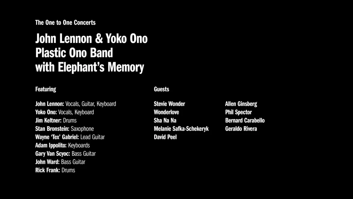
Of all the films that I’ve ever done, this is definitely the most graphics dependent, the graphics are a major part of what the film is.
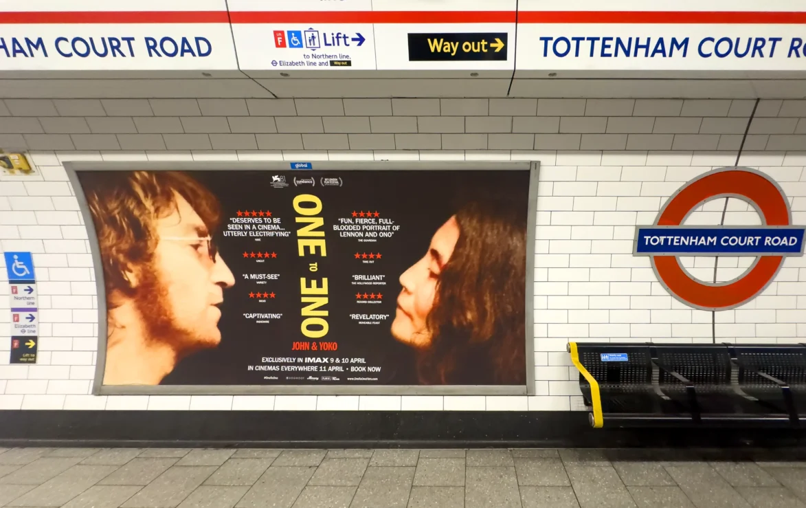
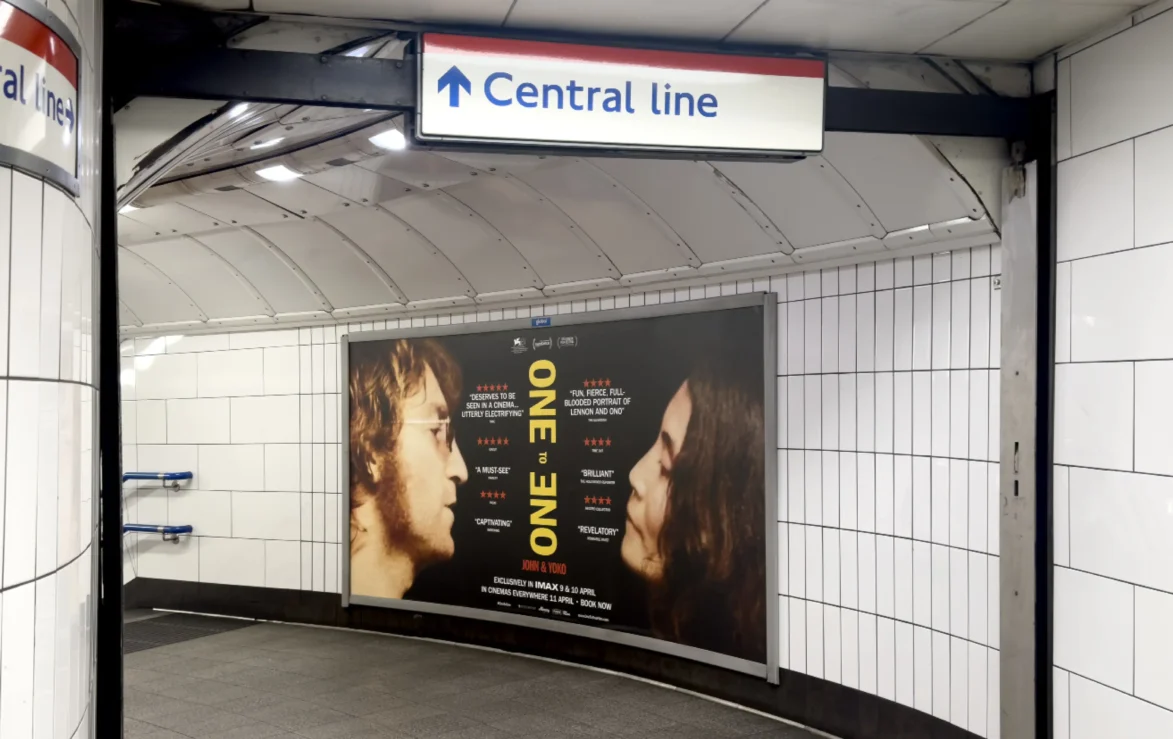
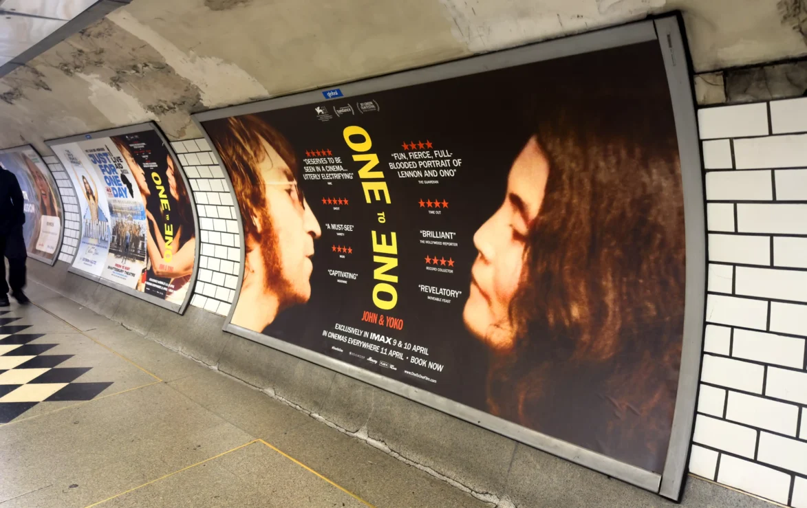
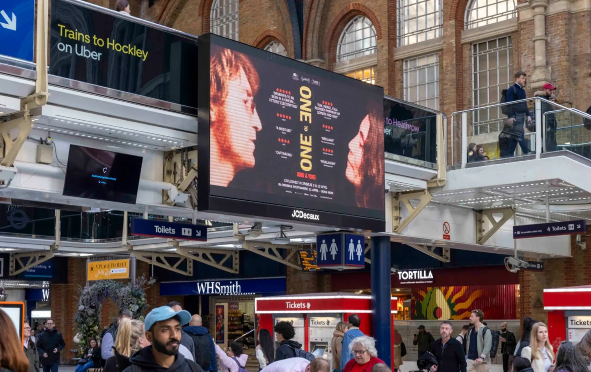
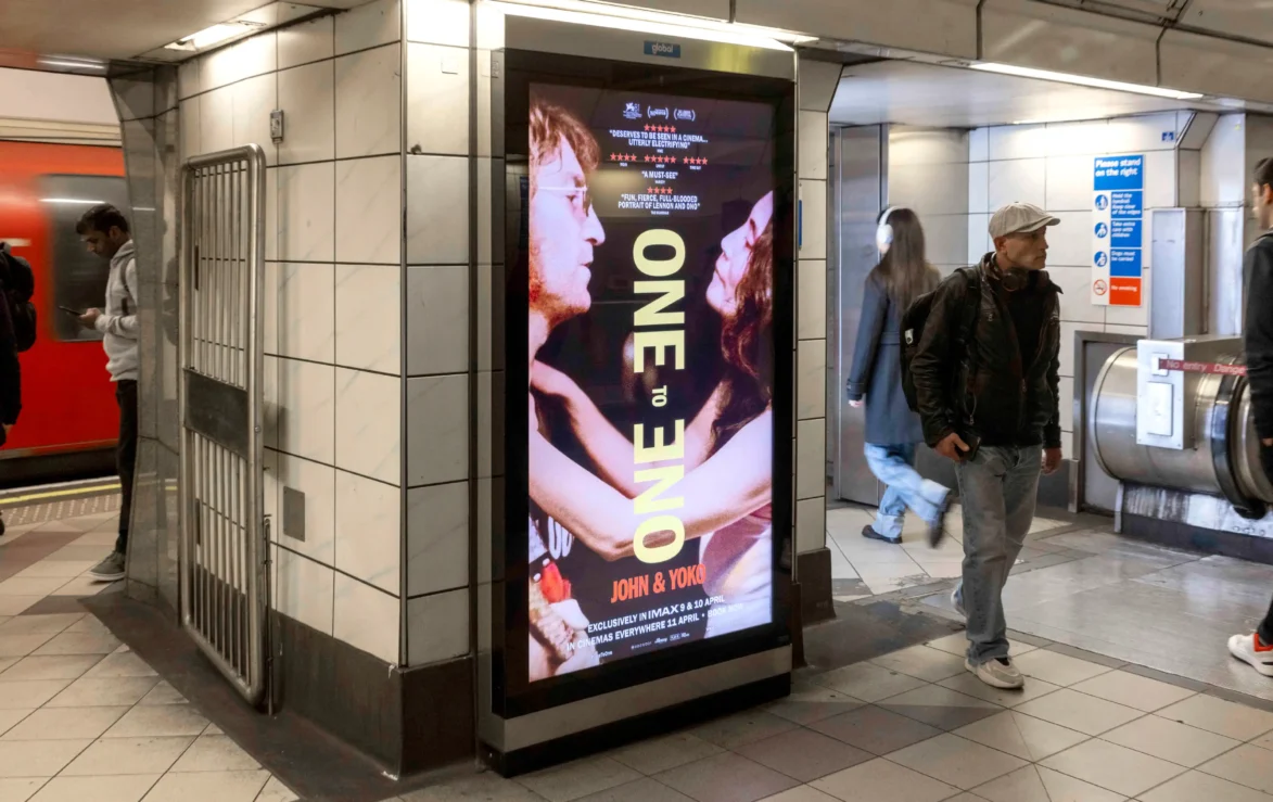
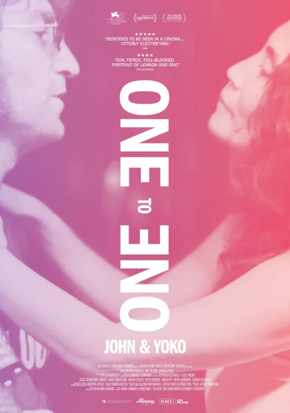
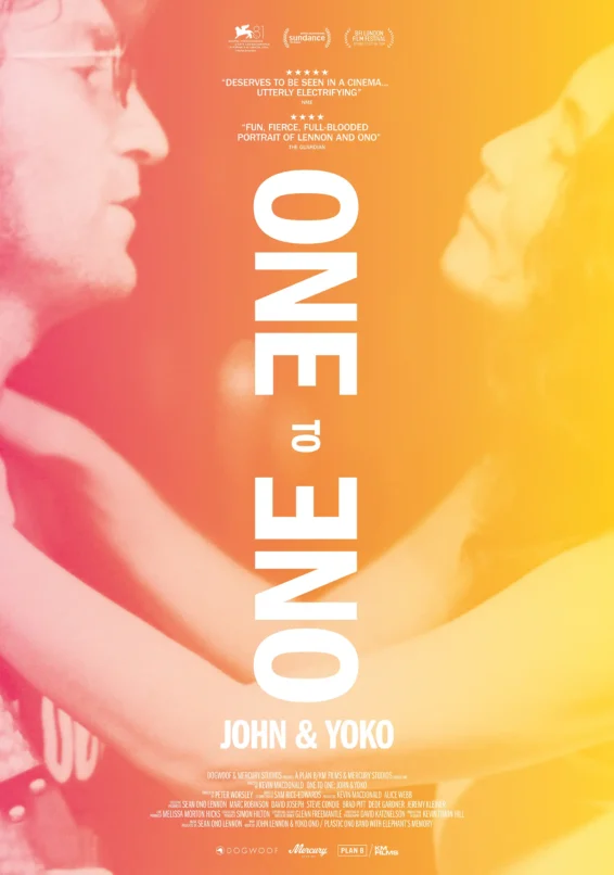
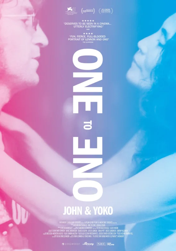
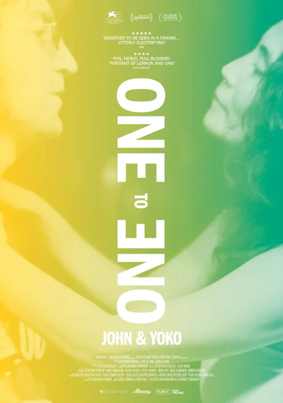
Poster campaign
Upon completion of the film, we were commissioned by Mercury Studios to design the key art. This included a full-colour poster in both portrait and landscape formats.
Additionally, we created limited edition versions of the poster in four different colourways.
The campaign was featured across the UK on National Rail, the London Underground, various out-of-home (OOH) locations, and in print media.
The most accomplished and arresting of these tightly angled Lennon profiles... The music gives the film shape and propulsion. But so does the way that Macdonald, keying off Lennon’s TV habit, presents images of the period as an ongoing channel-surfing montage.
Directed by – Kevin Macdonald & Sam Rice-Edwards
Edited by – Sam Rice-Edwards, The Assembly Rooms
Post Production – Bleat
Production Companies – Mercury Studios, Plan B/KM Films
Distributed by – Magnolia Pictures, Dogwoof
Images and video – Courtesy of Plan B/KM Films and Mercury Studios.