HYDA helmets
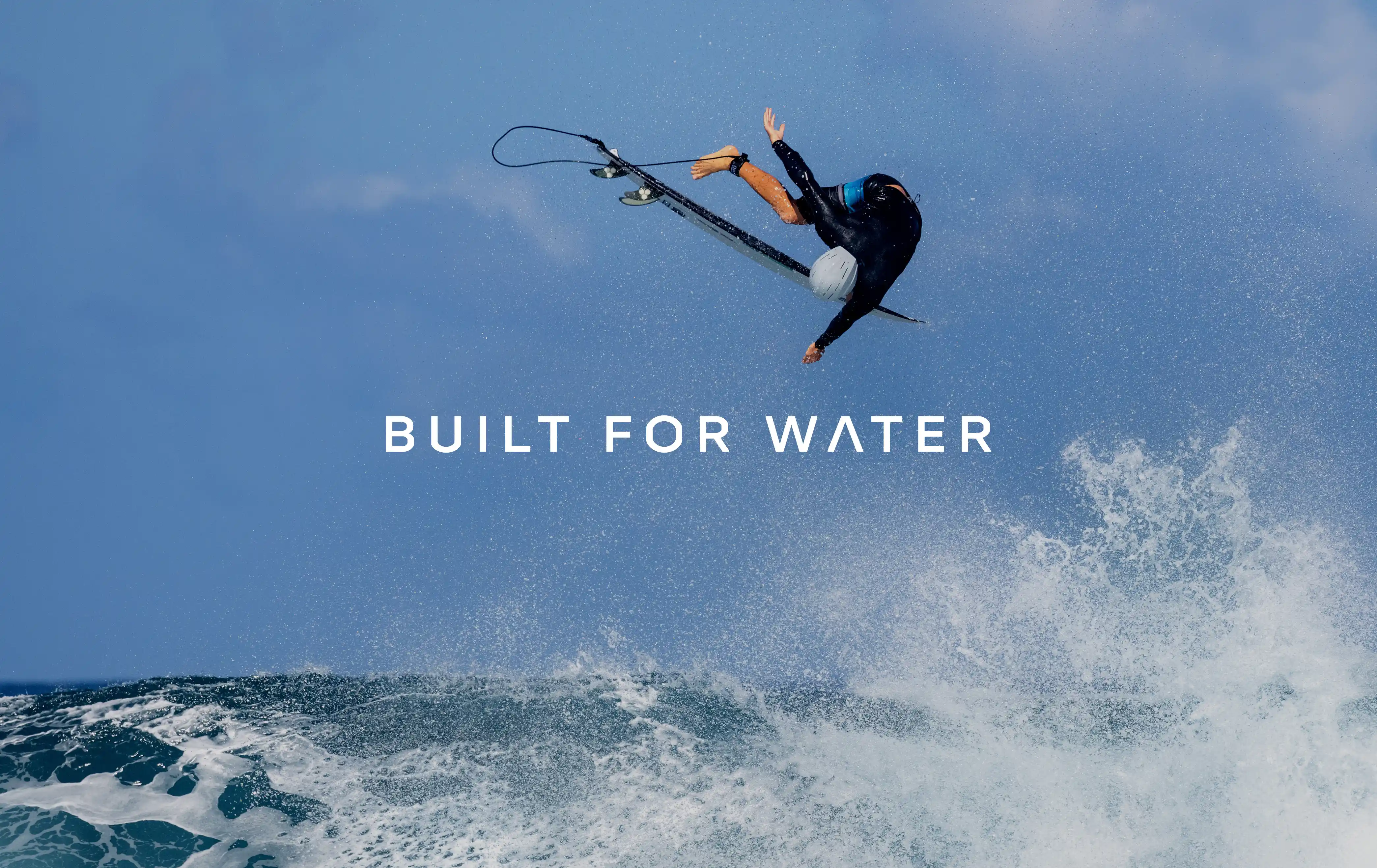
Built for water
HYDA is a trailblazer in water sport safety, creating helmets designed for those who live and breathe the ocean. With every wave, they’re redefining both safety and the sport itself.
Collaborating closely with the HYDA team, we reimagined the brand from the ground up, crafting a bold, high-energy identity that reflects its leadership in water safety.
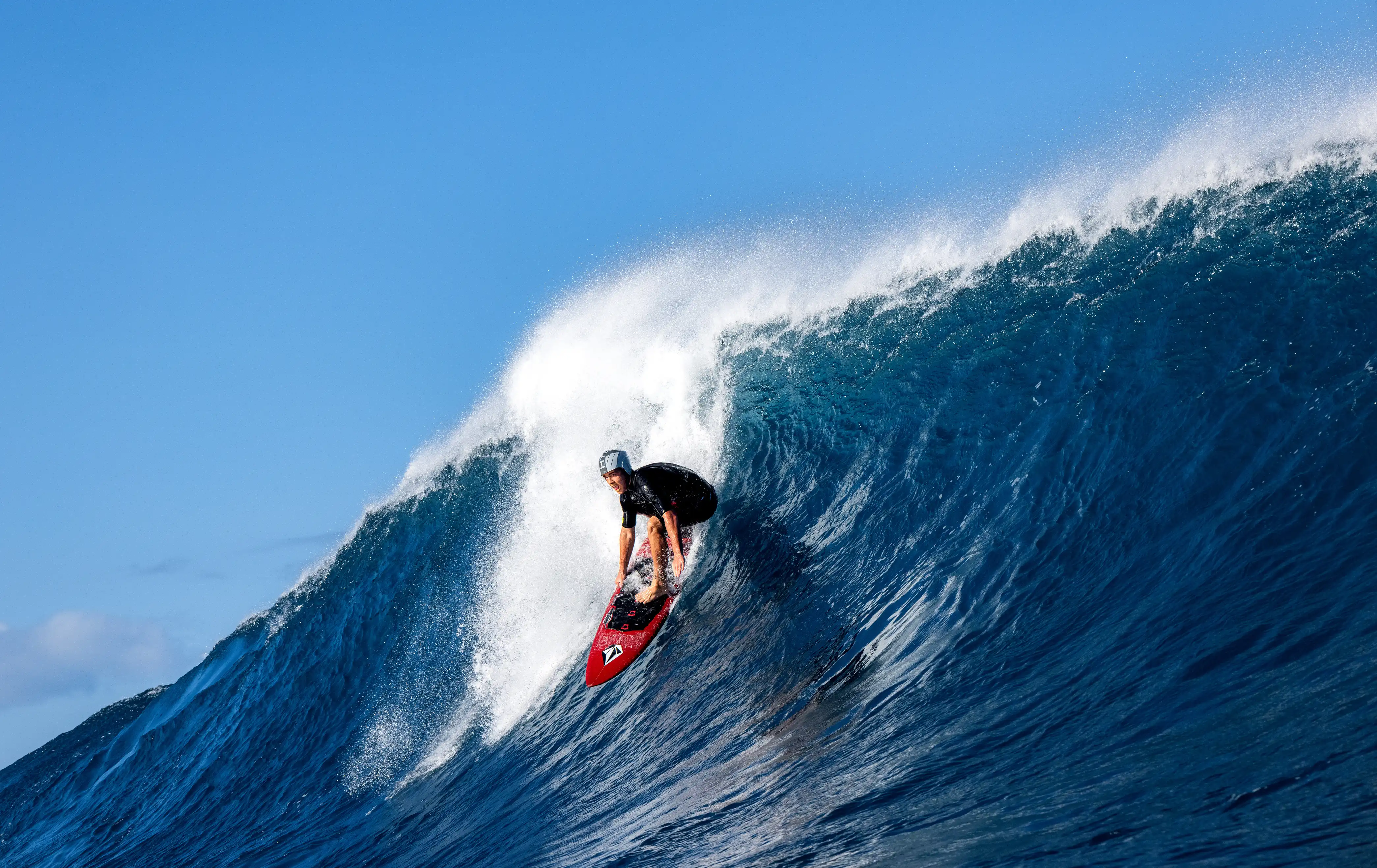
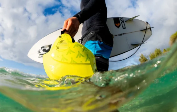
Founded by Terry Simms’ passion for surfing and commitment to safety. HYDA set out to design a streamlined, hydrodynamic helmet trusted by the world’s most elite big-wave surfers, including Garrett McNamara, as seen in the documentary 100 Foot Wave.
BUILT FOR WATER.
Scope
Brand strategy
Brand identity
Brand Implementation
Art direction
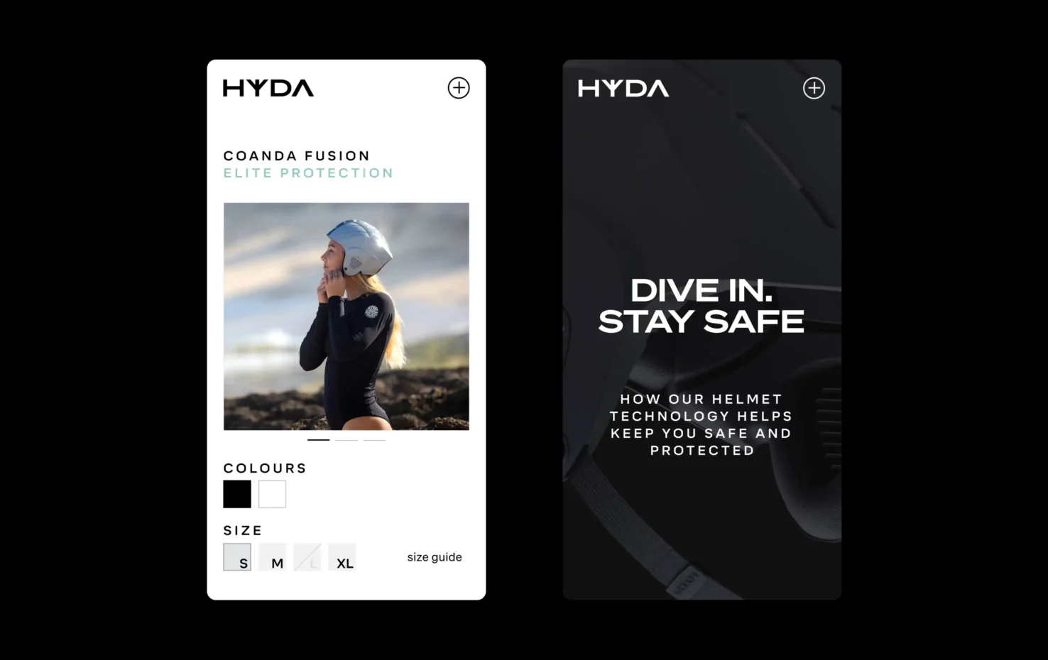
Digital design
Iconography
Motion
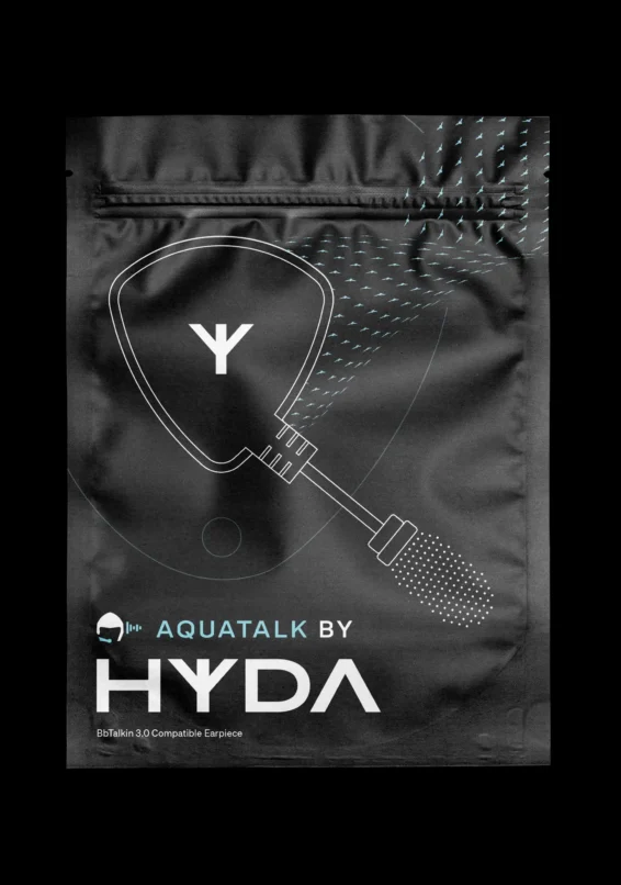
Packaging
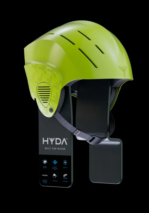
Helmet design
Verbal identity
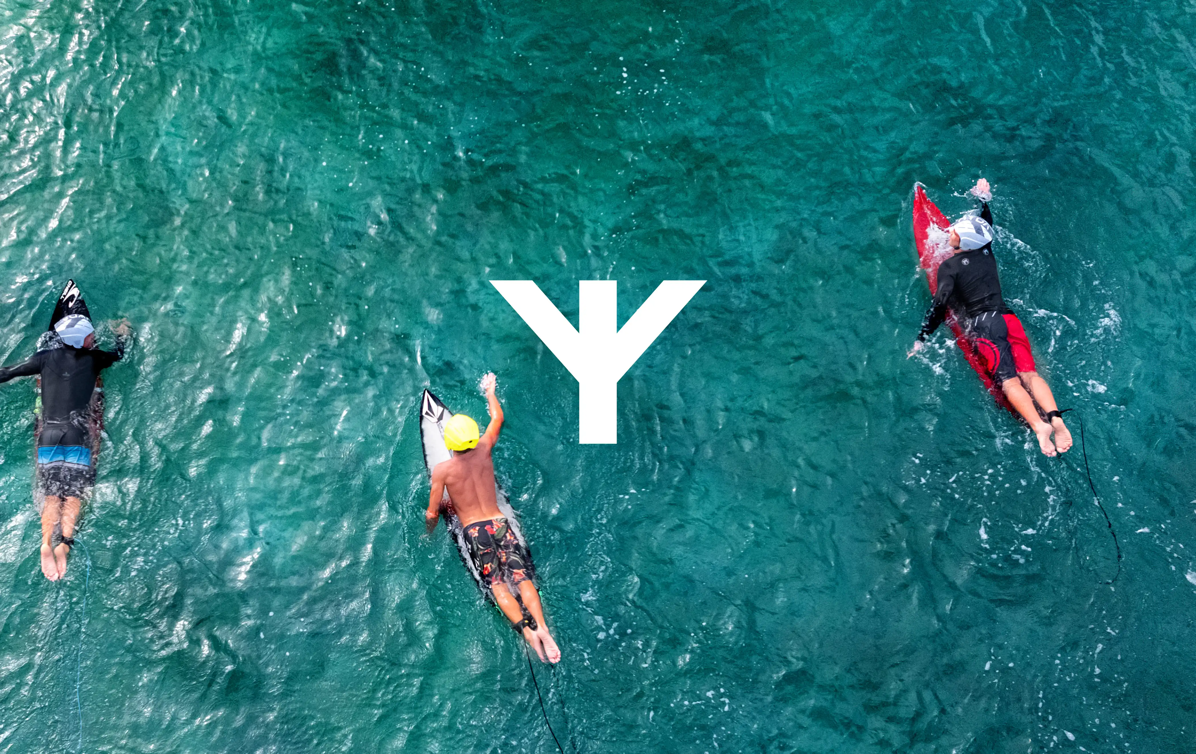
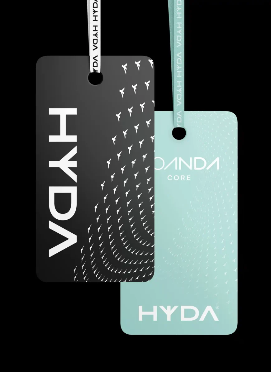
HYDA logo
The HYDA logo integrates the Trident ‘Y’ logo is more than a symbol - it's their commitment to safety etched in every product. The trident is linked to ancient gods of the sea, representing dominance over the oceans. In modern surf and ocean cultures, the trident symbolises strength, courage, and protection for those who face the power of the sea.
Trident wave
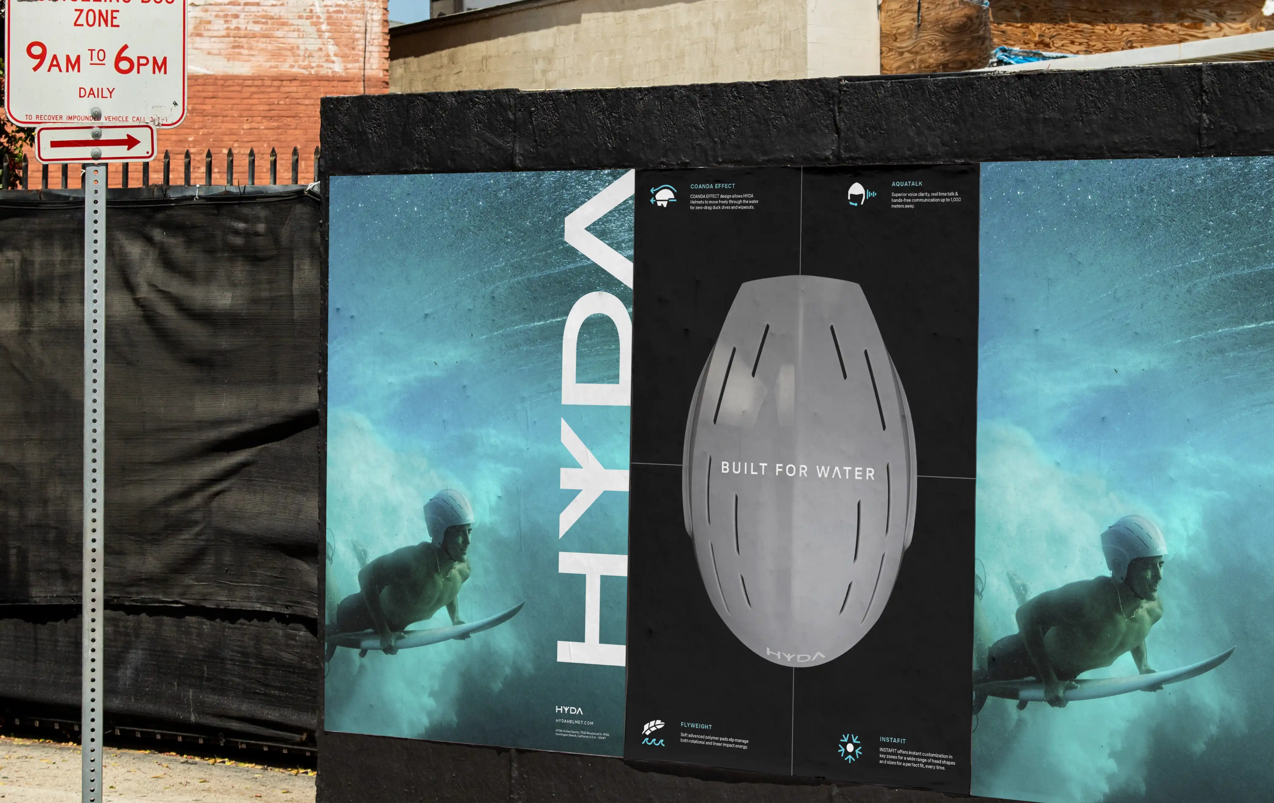
The Trident repeat wave pattern was designed as a bold and dynamic visual asset, adaptable for both motion and static applications. Reinforcing HYDA’s identity within its natural environment, the ocean where these helmets truly belong.
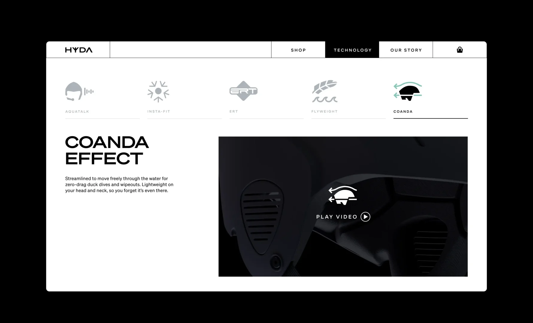
Icon system
HYDA needed a clear and simple way to convey the unique qualities of its helmets. To achieve this, we designed a suite of icons that were applied across all touchpoints, helping to communicate the story at a glance.
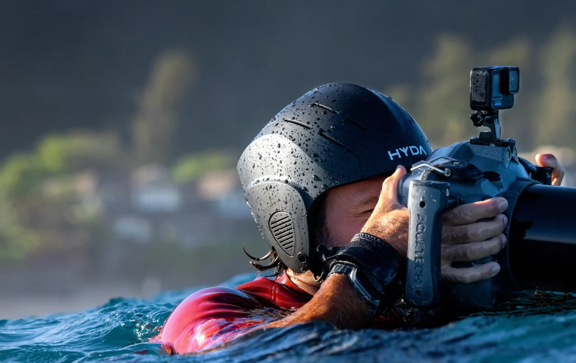
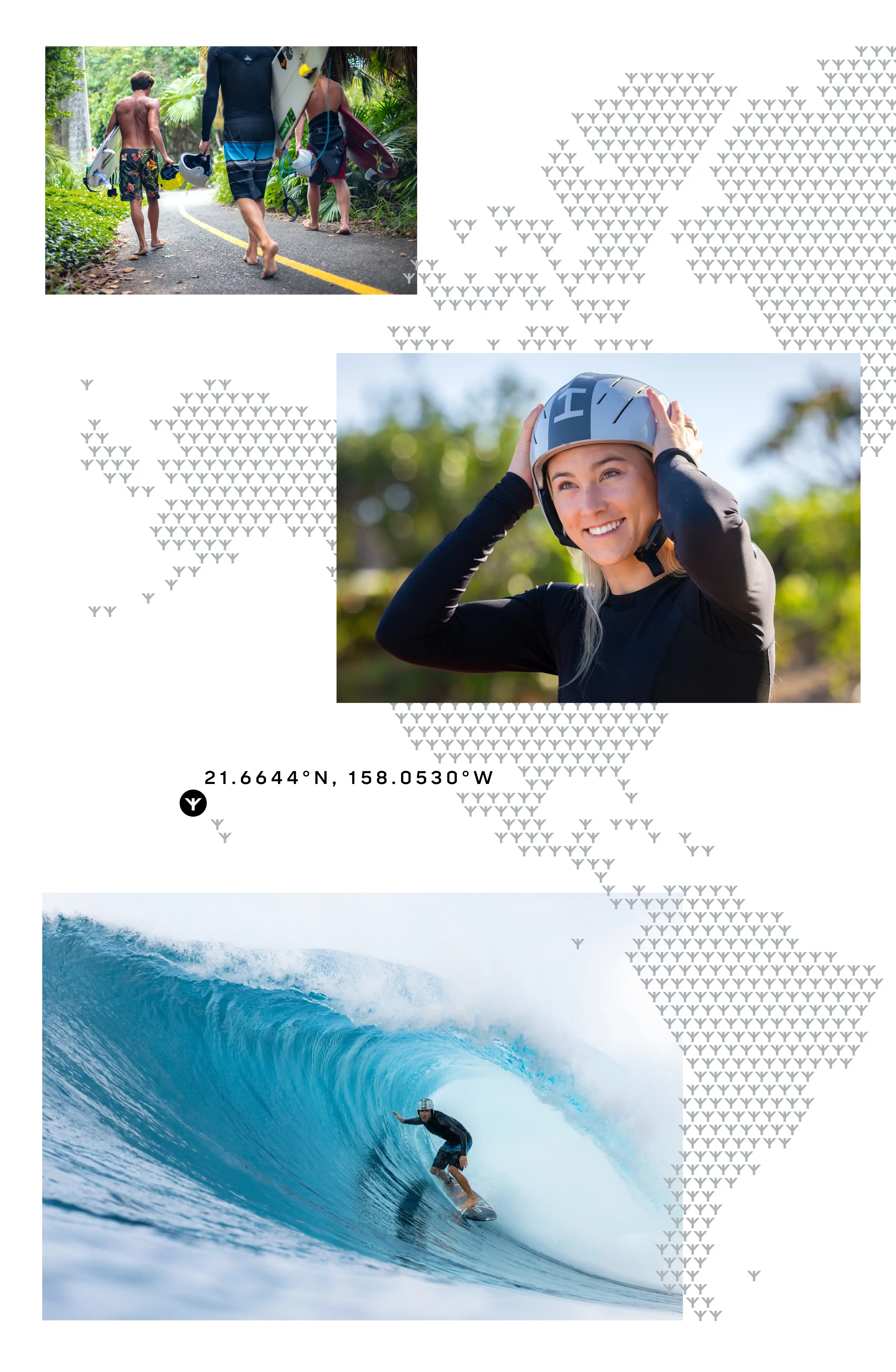
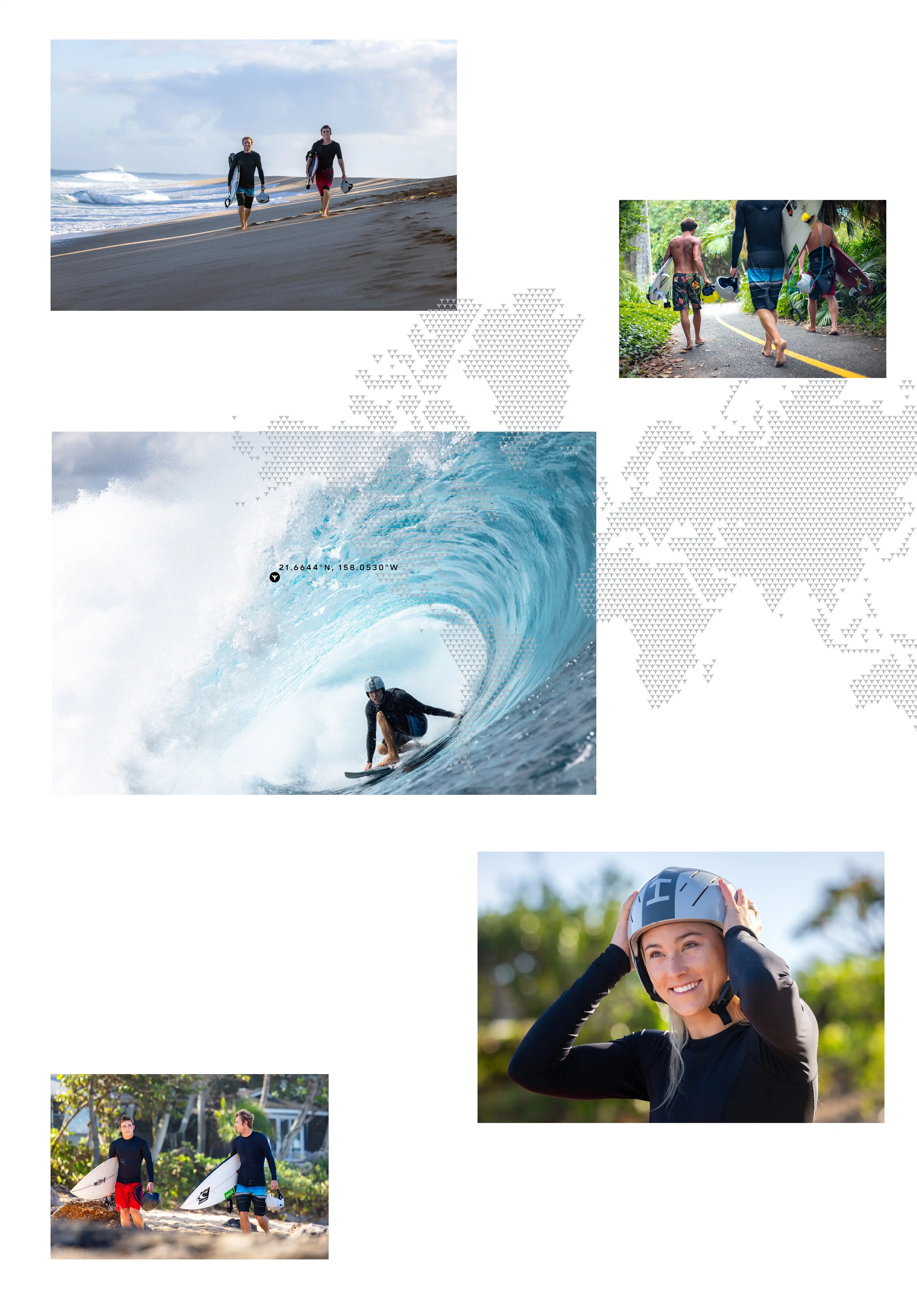
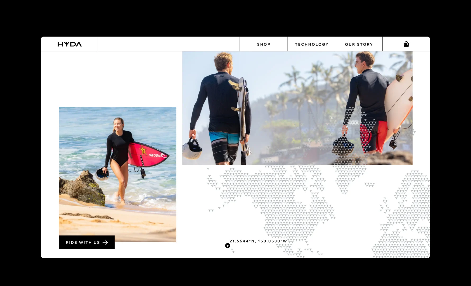
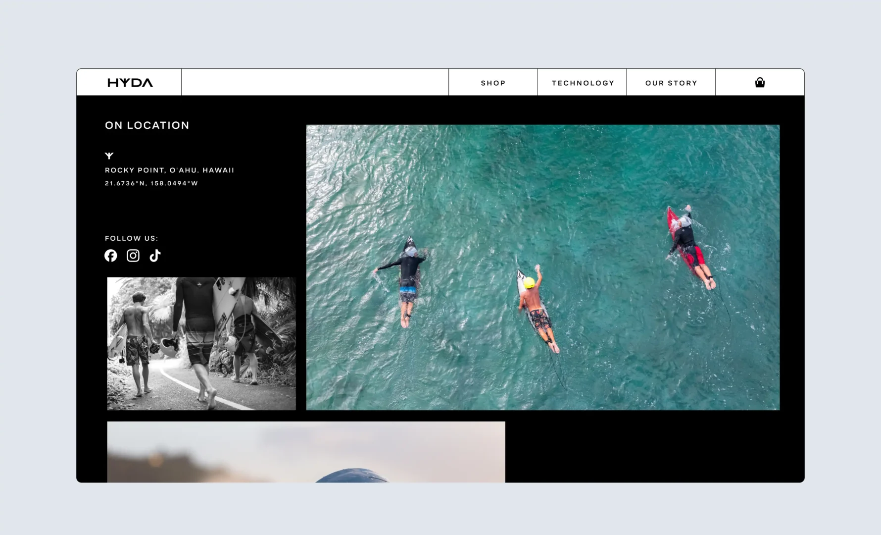
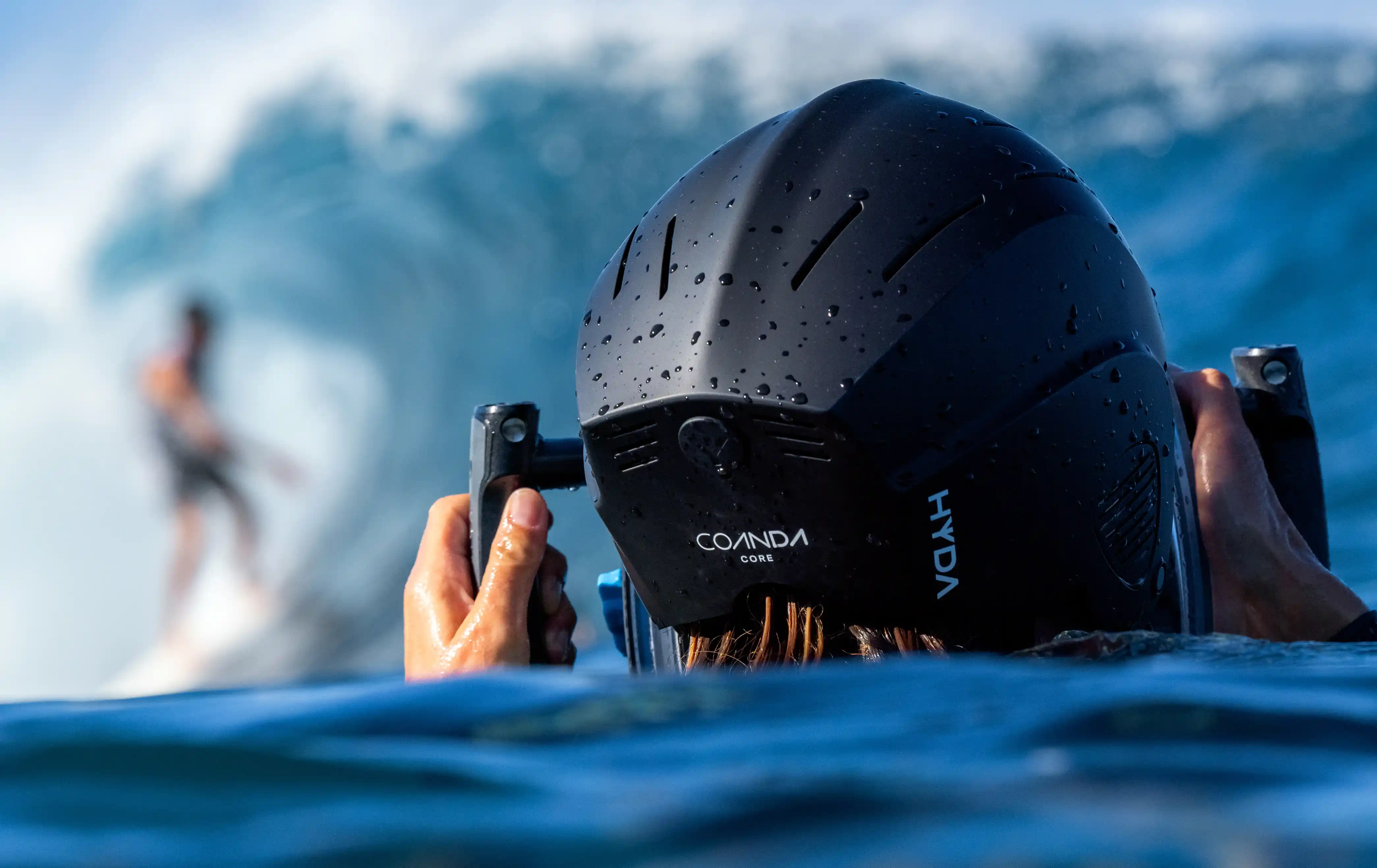
In action
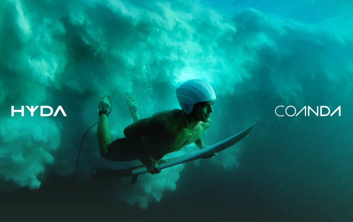
Shooting the helmets in action is what really makes the brand come alive. The HYDA crew headed out to Rocky Point and Pipeline in Hawaii to capture fresh, on-the-ground content across three core themes: Lifestyle, Product, and In-Action.
Planning Unit absolutely brought HYDA to life. They didn’t just create a logo and a set of brand guidelines, they built a complete visual strategy that feels modern, clean, and totally aligned with our concept of the brand.
Brand output
Working alongside HYDA team, we brought the visual brand to life across every touchpoint, including digital, social, helmet graphics, packaging, and marketing, creating a fully connected brand experience.
From icons and photography to the website, our collaboration built a framework guiding all marketing, ensuring an authentic, consistent brand voice today while setting HYDA up to connect with new audiences as it grows.
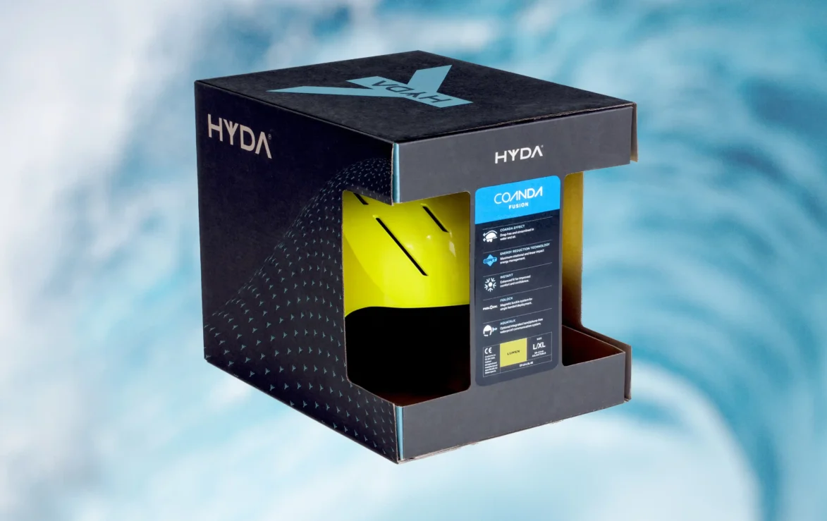
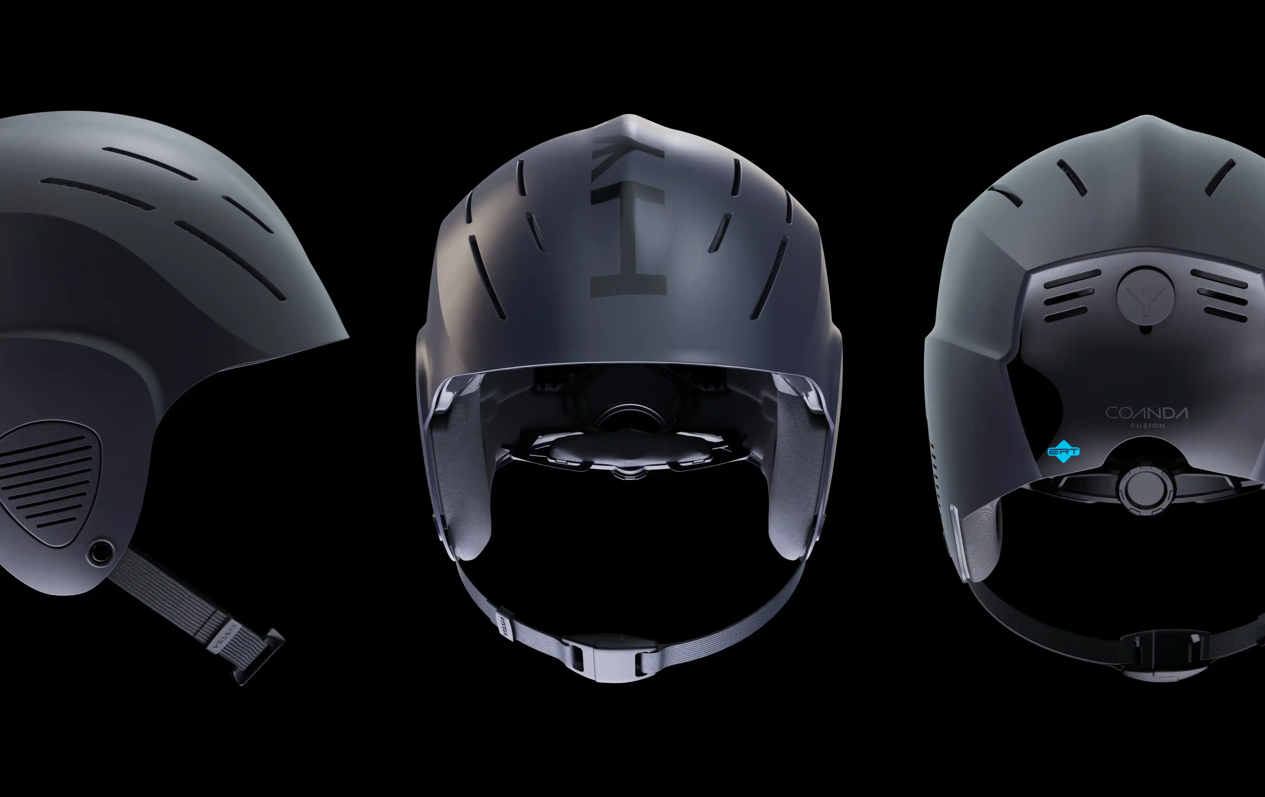
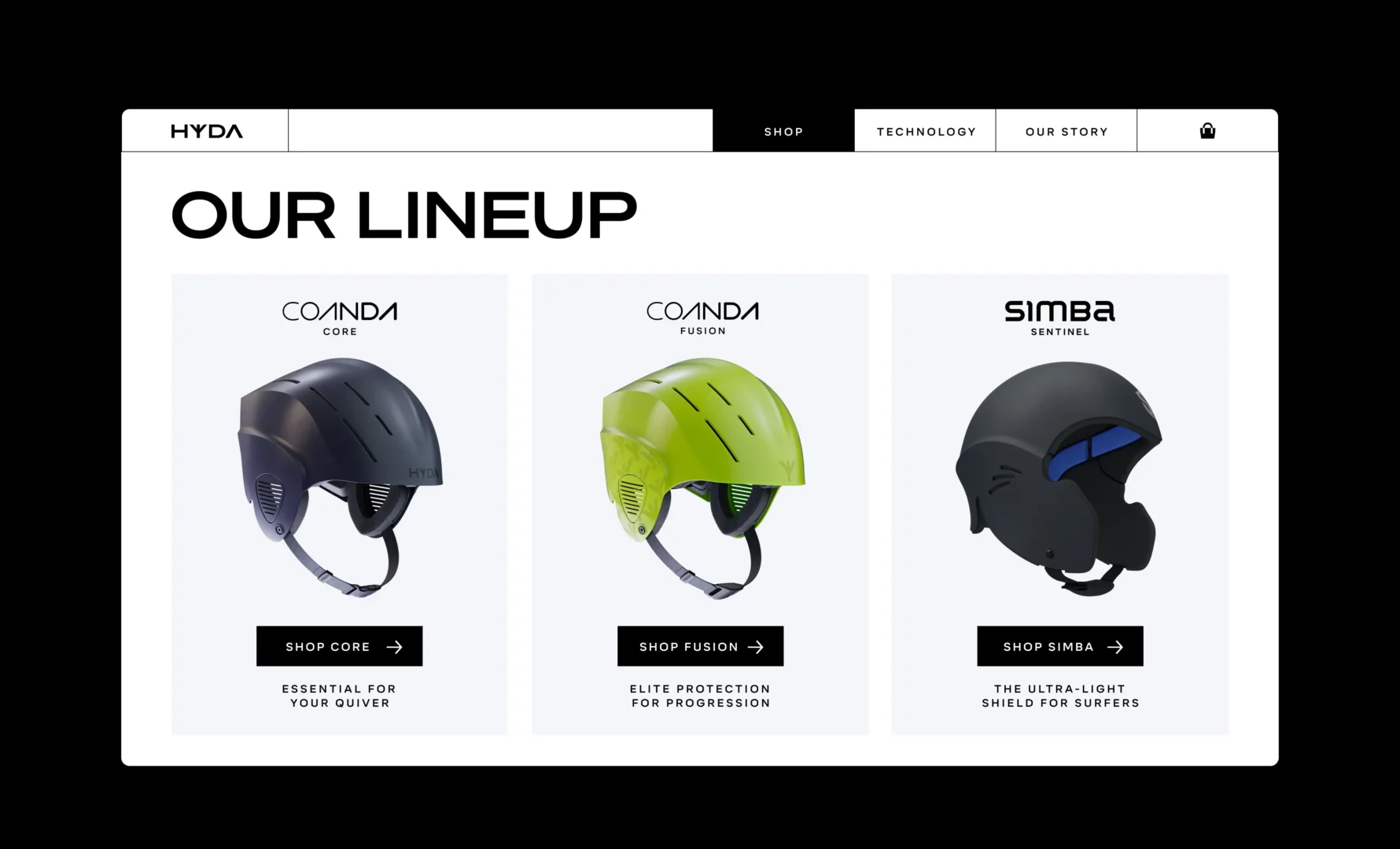
Coanda helmet range
The Coanda logo captures the sensation of wind in motion, symbolizing speed, agility, and aerodynamic efficiency. Inspired by the Coanda effect, its fluid lines and sweeping curves reflect the helmet’s lightweight design and the dynamic power of air in motion.
The best part for me personally was working with Planning Unit - they are absolutely tuned in to current cultural movements and the rapidly shifting ways which people interact with brands across the globe.
Team & Collaborators:
Greg & Amy – HYDA
Ryan ‘Chachi’ Craig – Photography
Brent Bielmann – Videography
Micah – Producer
Ültra Studio – Helmet 3D