D&AD50
50 years of excellence in design and advertising
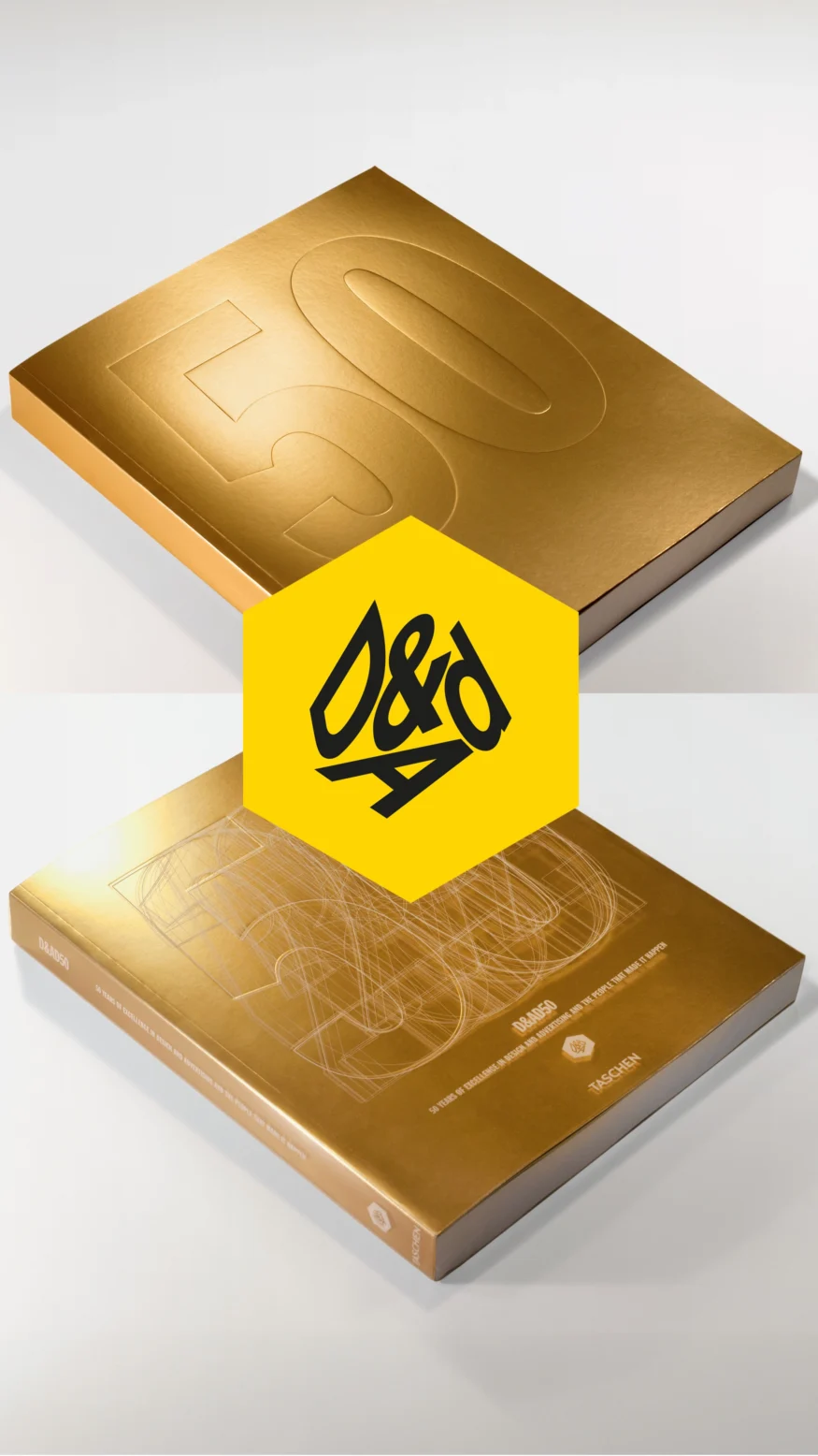
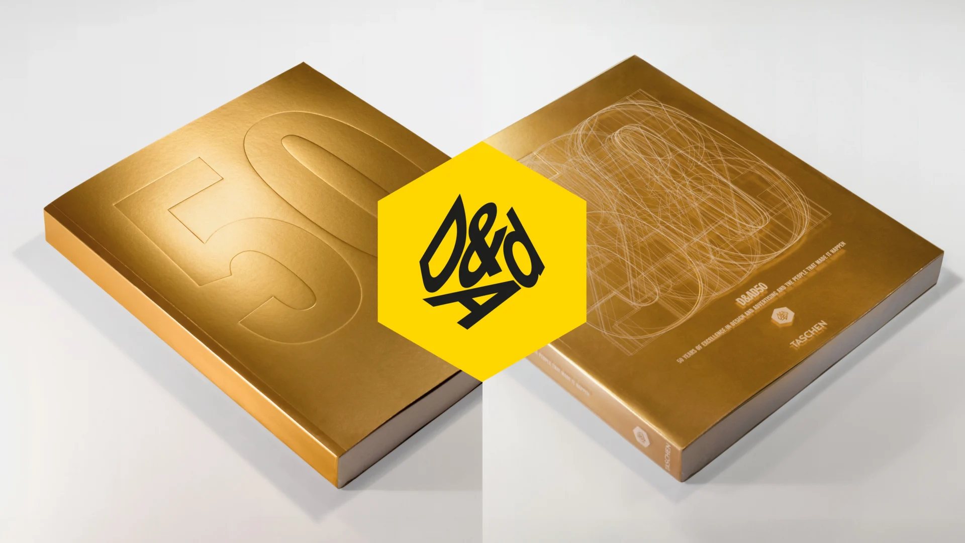
D&AD is the most prestigious creative awards in the world. We were honoured to be asked to design its 50th anniversary book.
From the birth of TV advertising in the ’60s to the digital revolution of the 2000s, D&AD has lived through it all and helped to shape what it is today. This is a chance to explore the cream of creative communications over the past five decades.
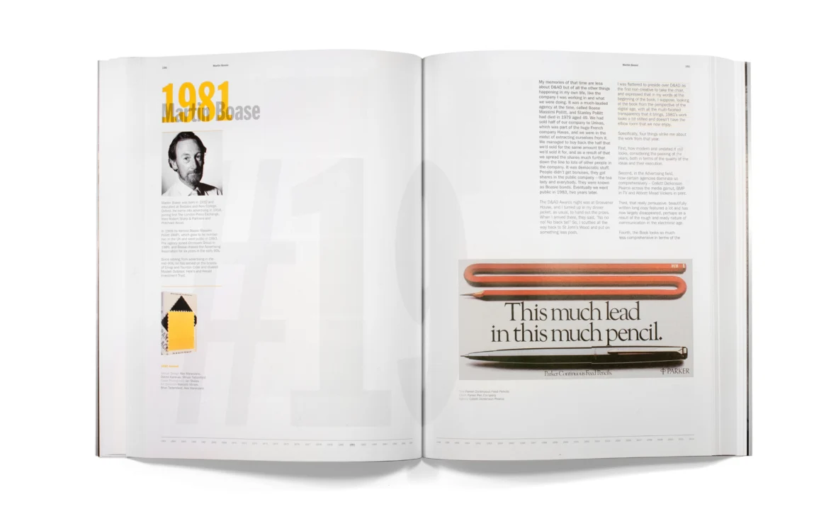
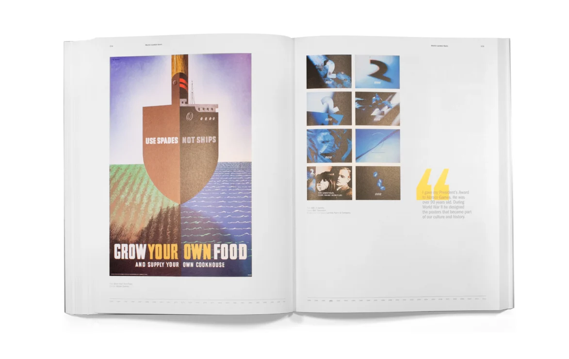
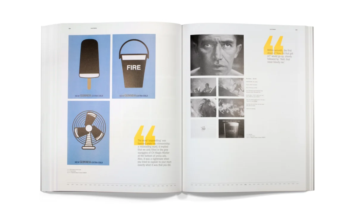
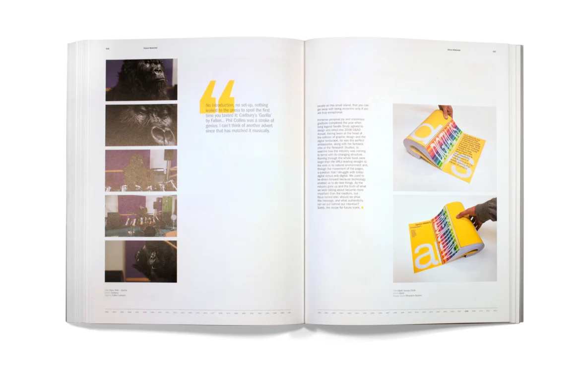
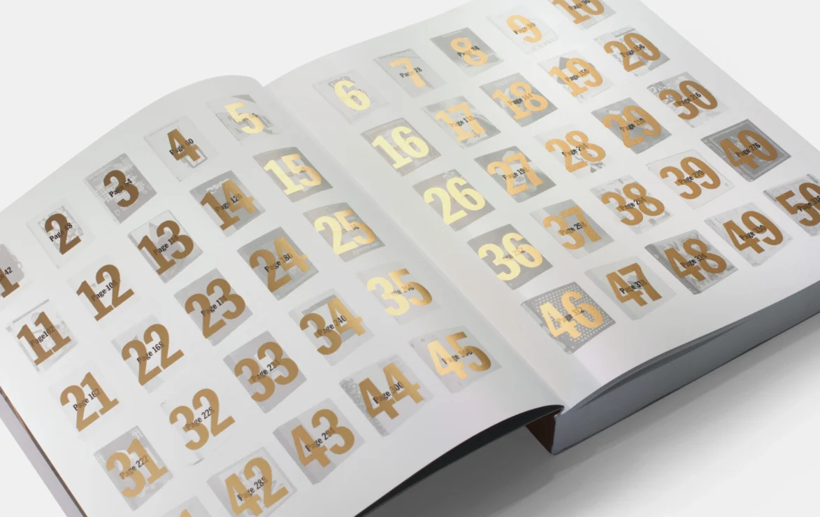
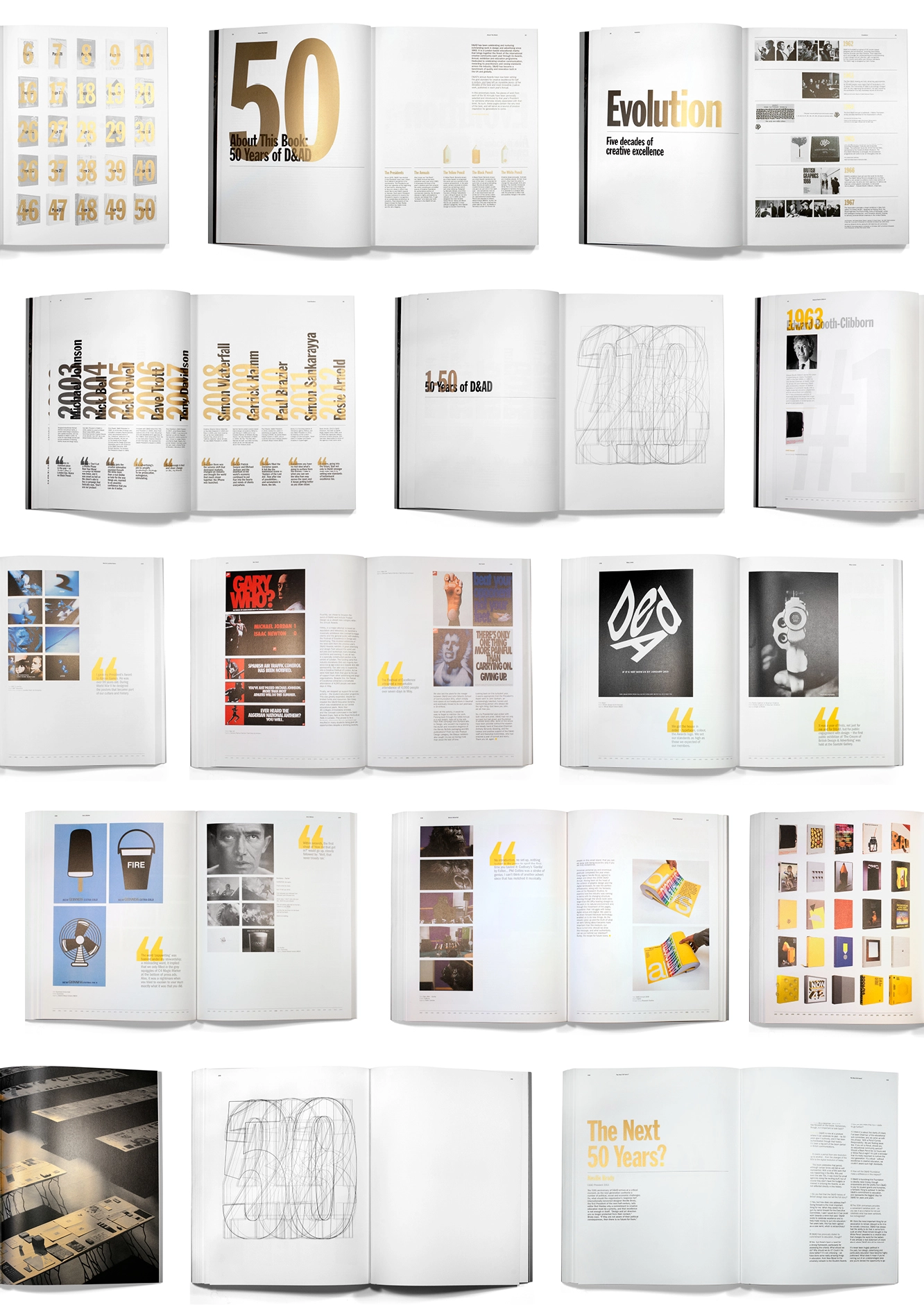
The book, published by Taschen, is commemorated by both the advertising and design worlds as a celebration of the very best of the best. It presents 50 individual President perspectives on the evolution of British and international creativity, from 1962 to 2012. Across 50 chapters (one for each year), beautiful imagery, stills and narrative play out over each page.

Designing the book
Despite gathering work from a wide range of disciplines and spanning several decades, the book maintains a consistent design. We achieved this by creating a simple, scalable system with page elements, ensuring a seamless flow between each President's chapter.


Original Planning Unit
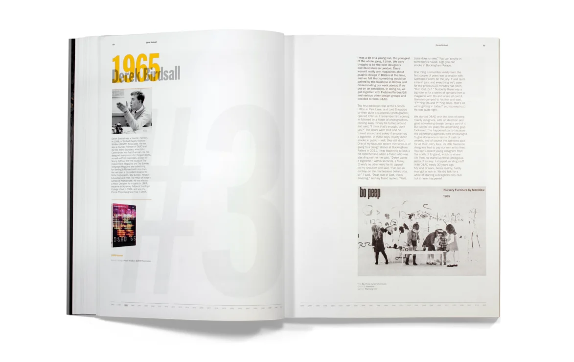
During the process of designing the book we were delighted to discover Planning Unit’s pre-incarnation, as founded by Nick’s grandfather, featured in the 1965 Annual, as picked out by Derek Birdsall as his favourite work of the year.

Planning Unit were a pleasure to work with, both for their immense talent and their enthusiasm for the project. The passion they put in shows in the final result: a gorgeous book that’s received critical acclaim from every major industry publication. We could not have hoped for a better result.
Thanks to:
Holly and Jana – D&AD
Rod – Editor
Julius – Taschen
More of our work with D&AD
51st Awards
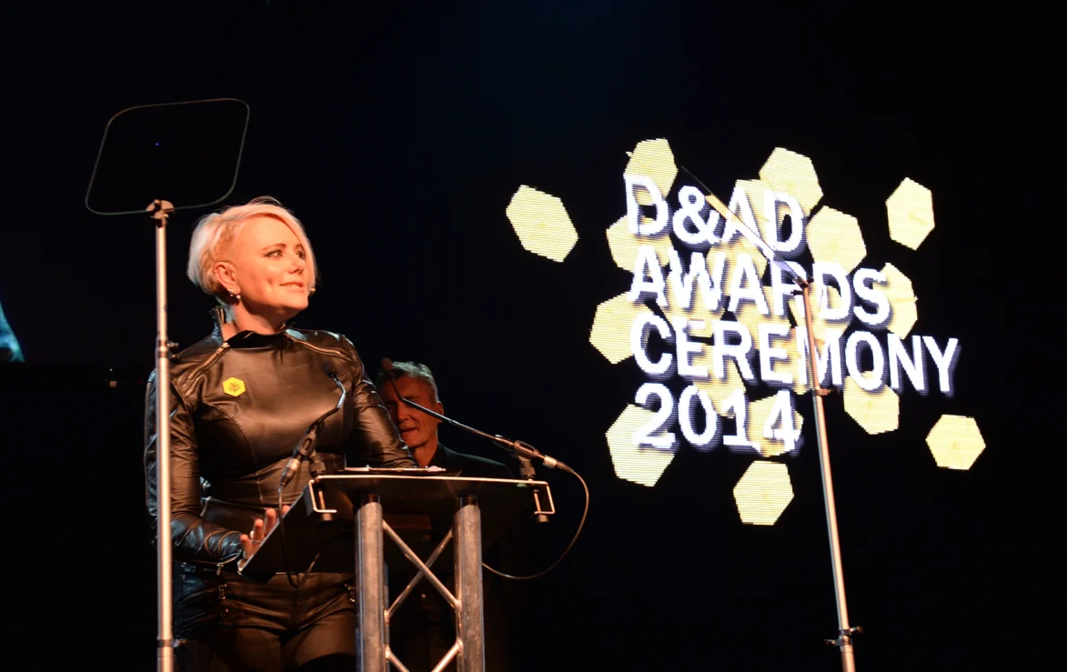
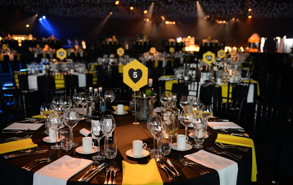
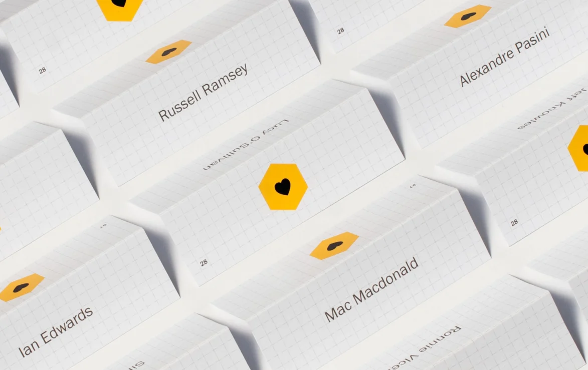
As a creative industry awards body, D&AD inspires excellence in creativity and celebrates it with the lionised Yellow Pencil. Every year, it’s celebrated with the awards ceremony. We were brought onboard to create all the awards assets, from invites through to on the night installations.
Building on Wieden + Kennedy’s concept, ‘I Wish I’d Done That’, we took the Yellow Pencil and worked inside out. We symbolically and graphically deconstructed the famed hexagonal pencil.
Shooting for the moon
Going a step further, we designed a 3-metre high zoetrope, which featured as a centrepiece at the award ceremony. Inside, a visual carousel of D&AD’s finest entries – captured through a 16-frame strobe, an analogue ode to the theme’s original digital concept.


We also introduced manual zoetropes, taking the whole concept back to basics as a truly interactive component for the awards night.

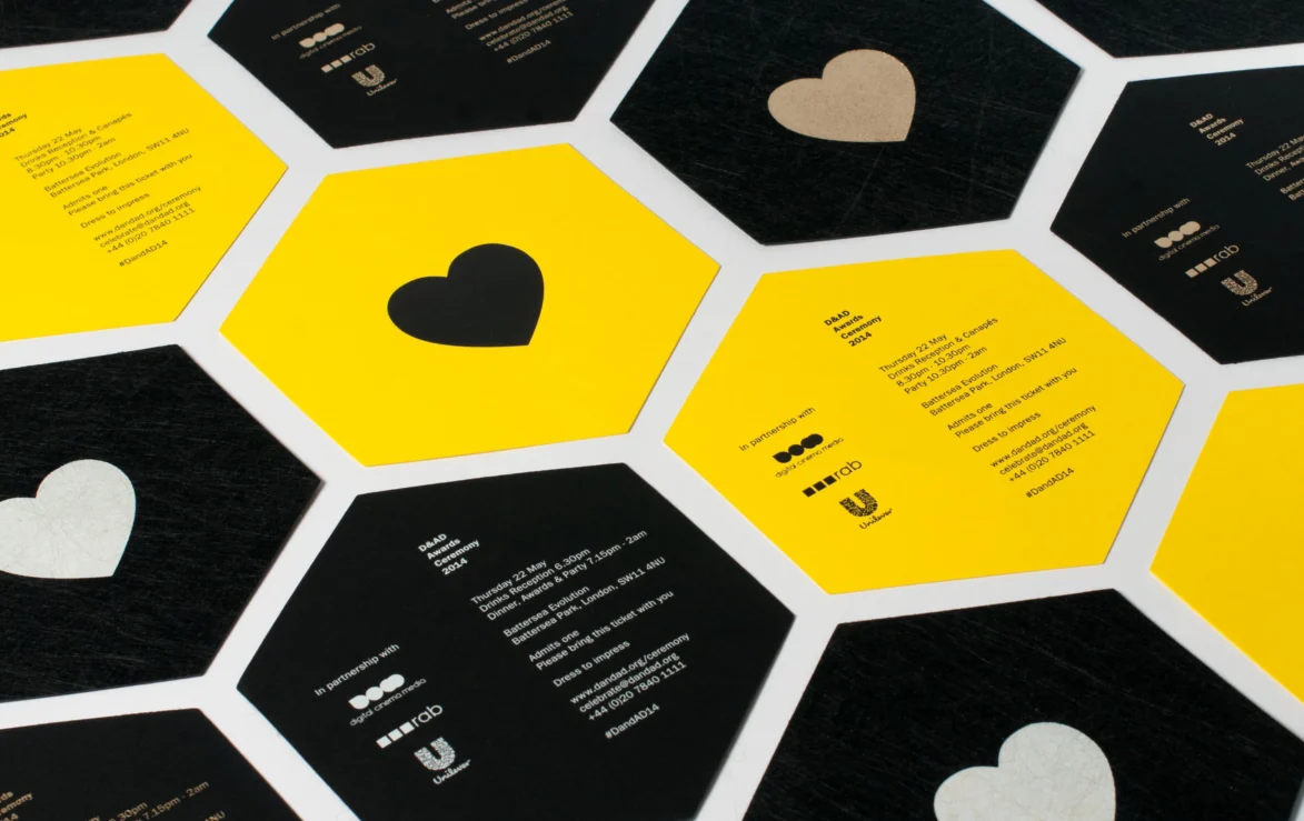
Award night materials
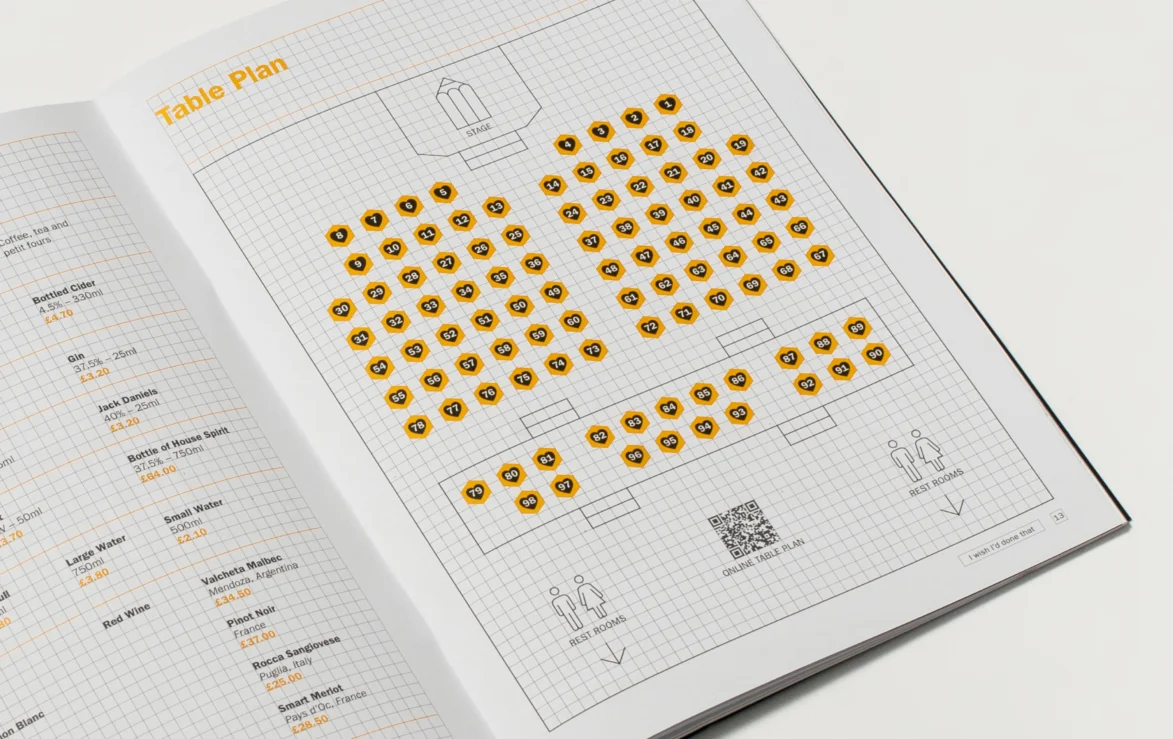
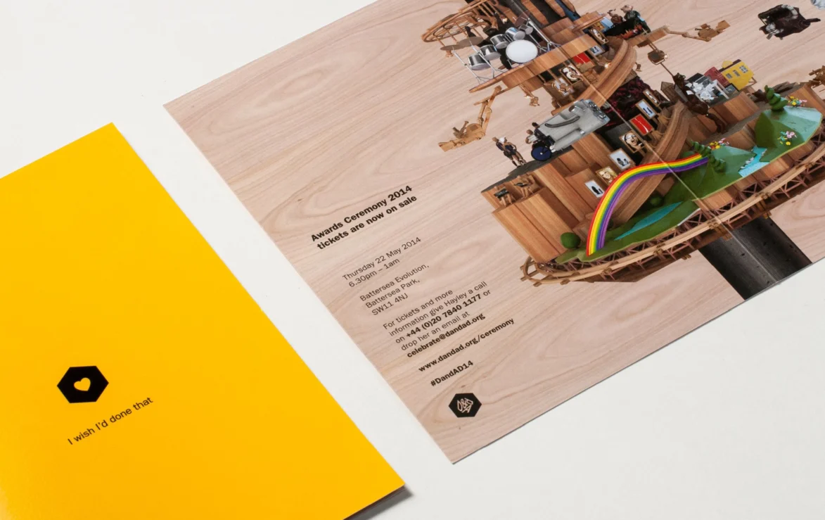
Pencil slices became graphic containers and extended to all communications, including invites and book of the night.
