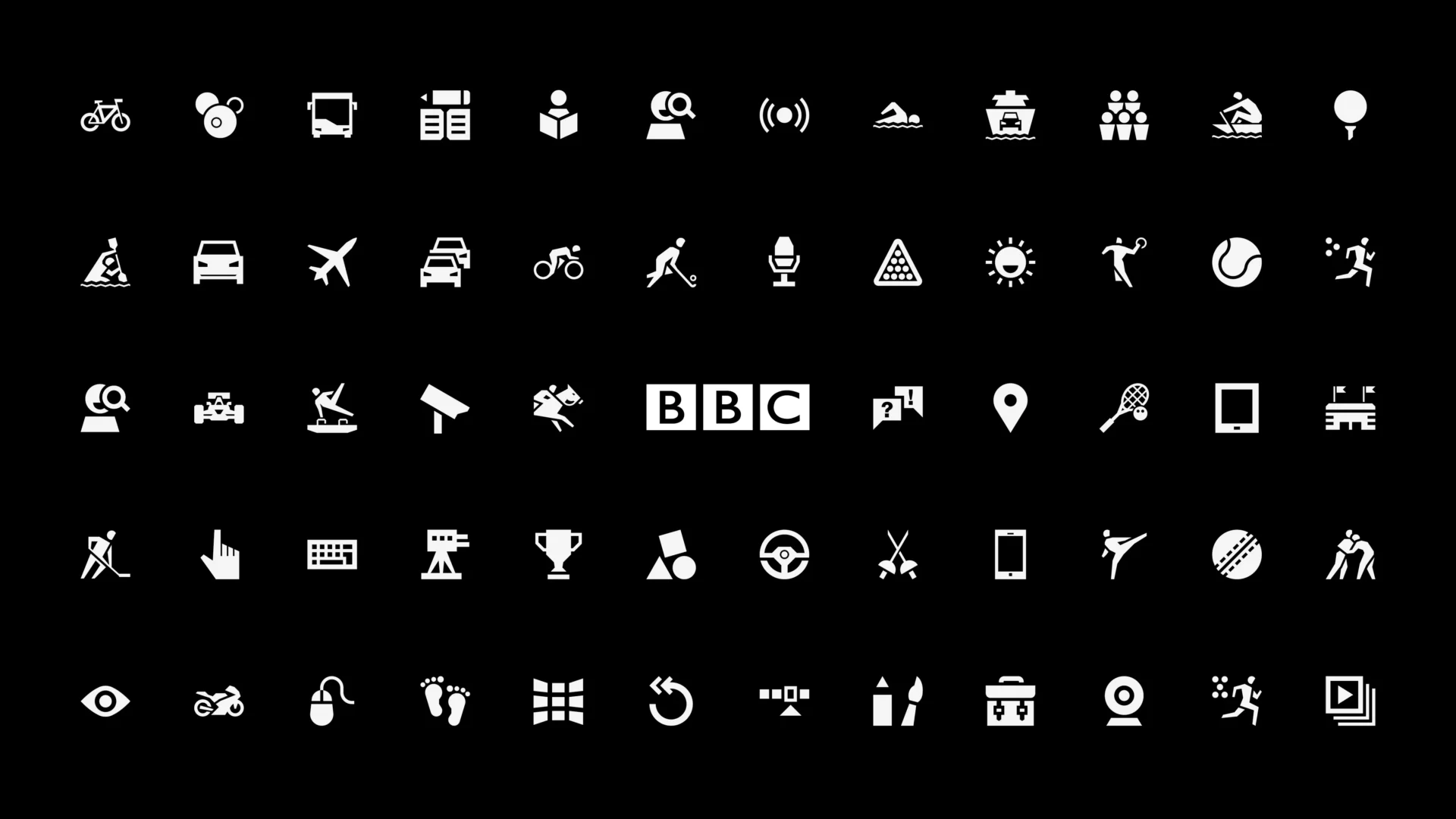
BBC icon suite
Crafting 180 icons to unify the BBC digital products
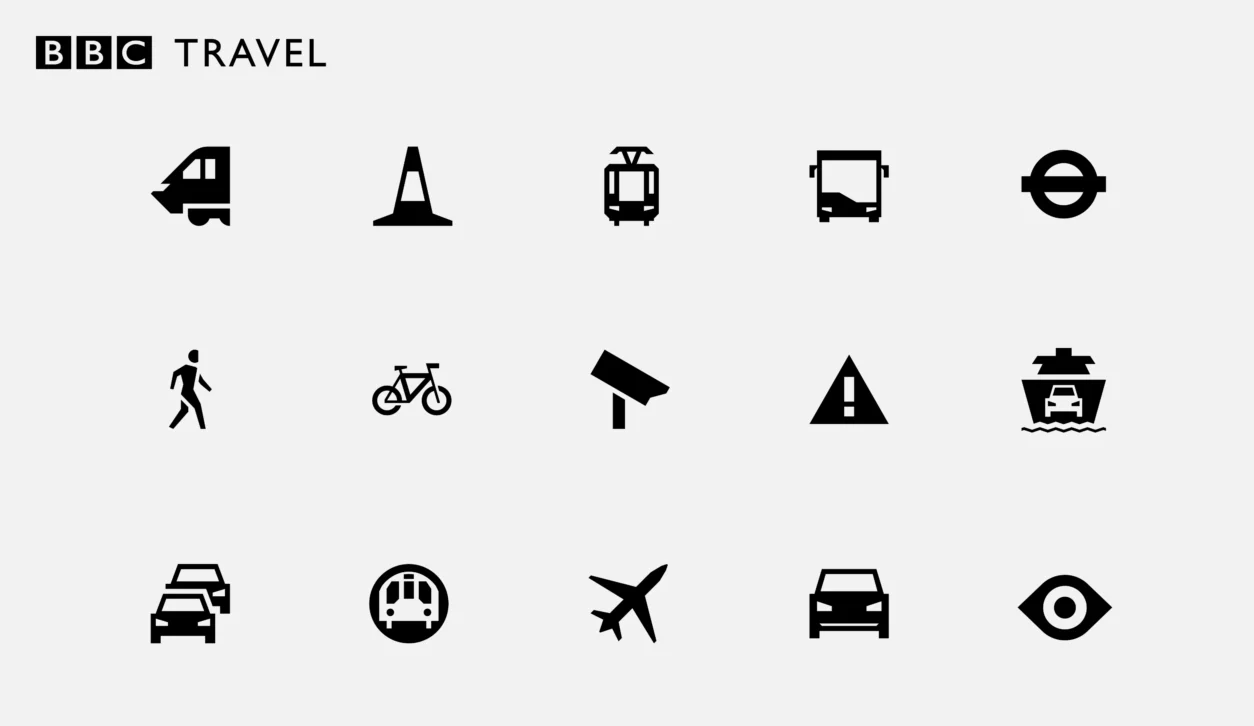
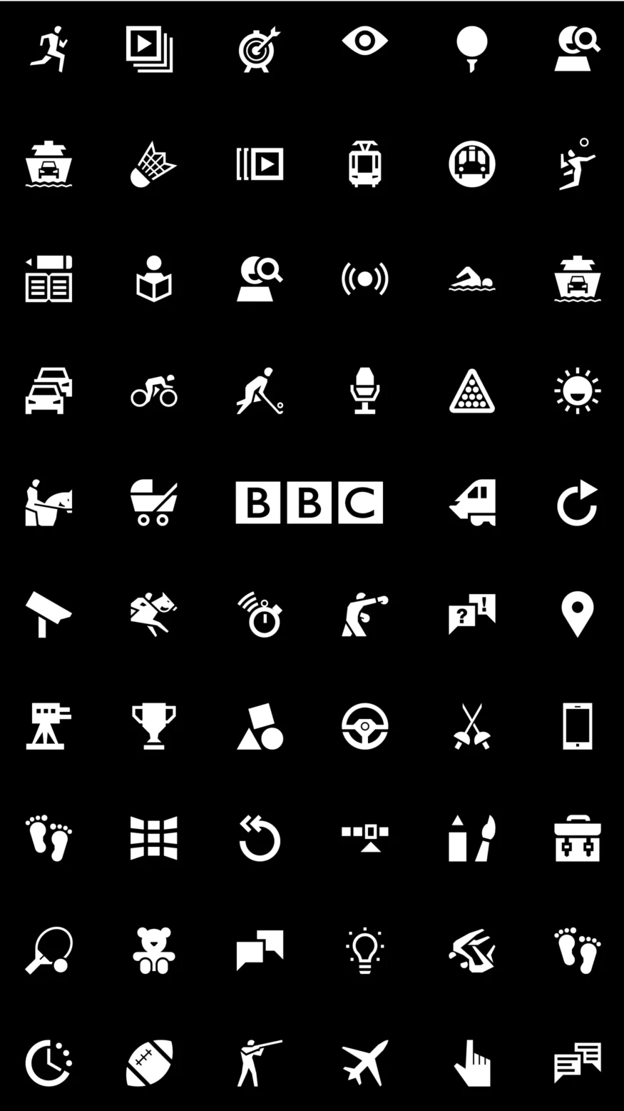
The BBC: a unique British institution and the world’s leading public service broadcaster. Planning Unit was invited to create a consistent visual language for the BBC – a suite of icons – to be introduced to its core areas; iPlayer, Sport, Travel, Children’s, Weather and Social. The suite would be used in every aspect of the BBC’s digital space and form the vocabulary of its Global Experience Language (GEL).
The aim was to create a common look and feel across the core areas, whilst injecting individual personality through each of the icons so that they visually translate the subject matter. The final result? A suite of 180 icons; a modern and cohesive showcase of what the BBC currently represents in its digital evolution.


The brief
Creating a coherent set of icons, that work across the seven disciplines of the BBC.
Modern Britishness
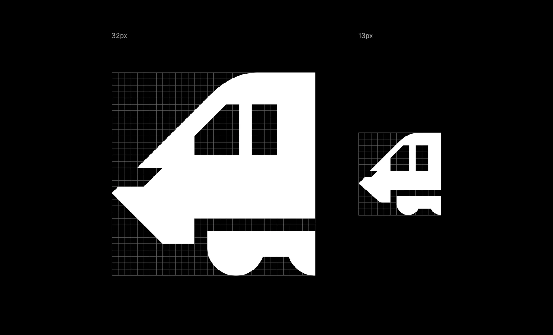
The InterCity train and the classic BBC microphone are two examples of how we integrated themes of the BBC, modern Britishness and uniqueness into the design.
Legibility
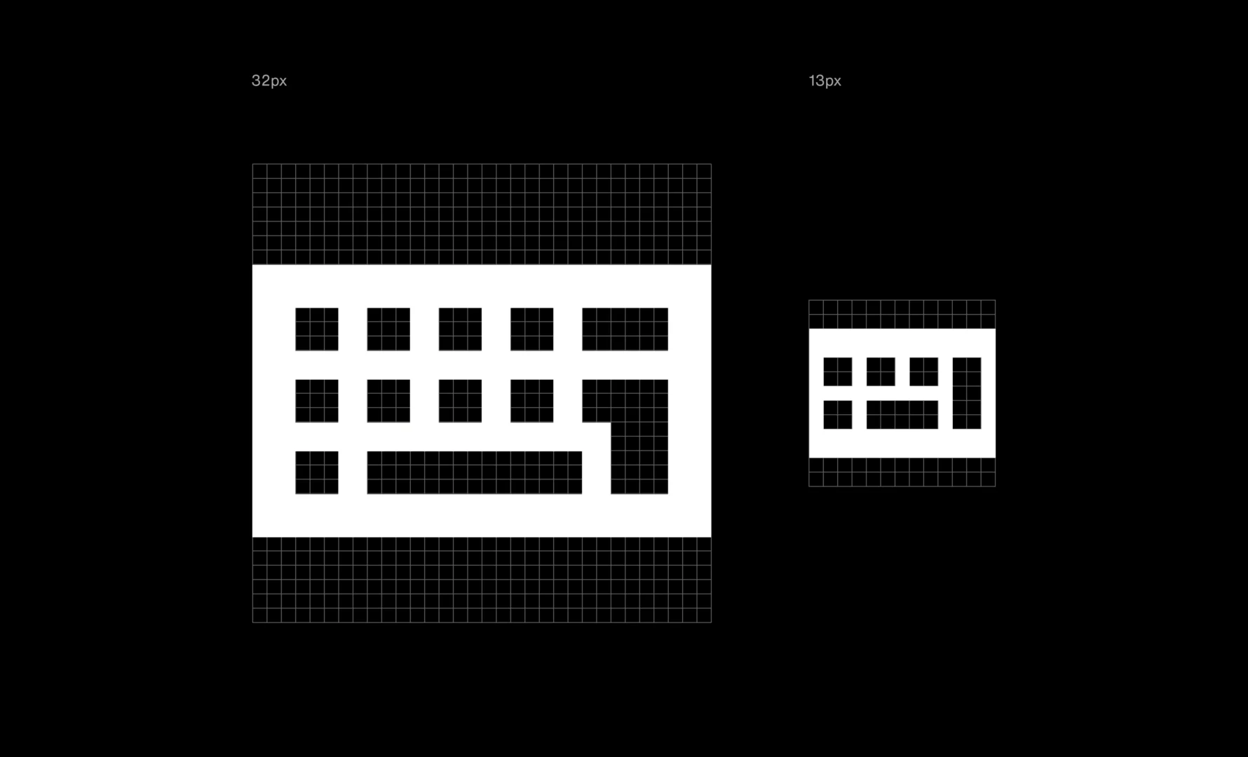
The technicalities of the project required the icons being optimised to work at 32 and either 16 or 13 pixels in size. In most cases, the smaller icons needed a complete redesign to ensure desirable visual legibility.
Sport
Vision
Adding a 'face' to the icons gave both character and importantly direction, making them easier to instantly understand.
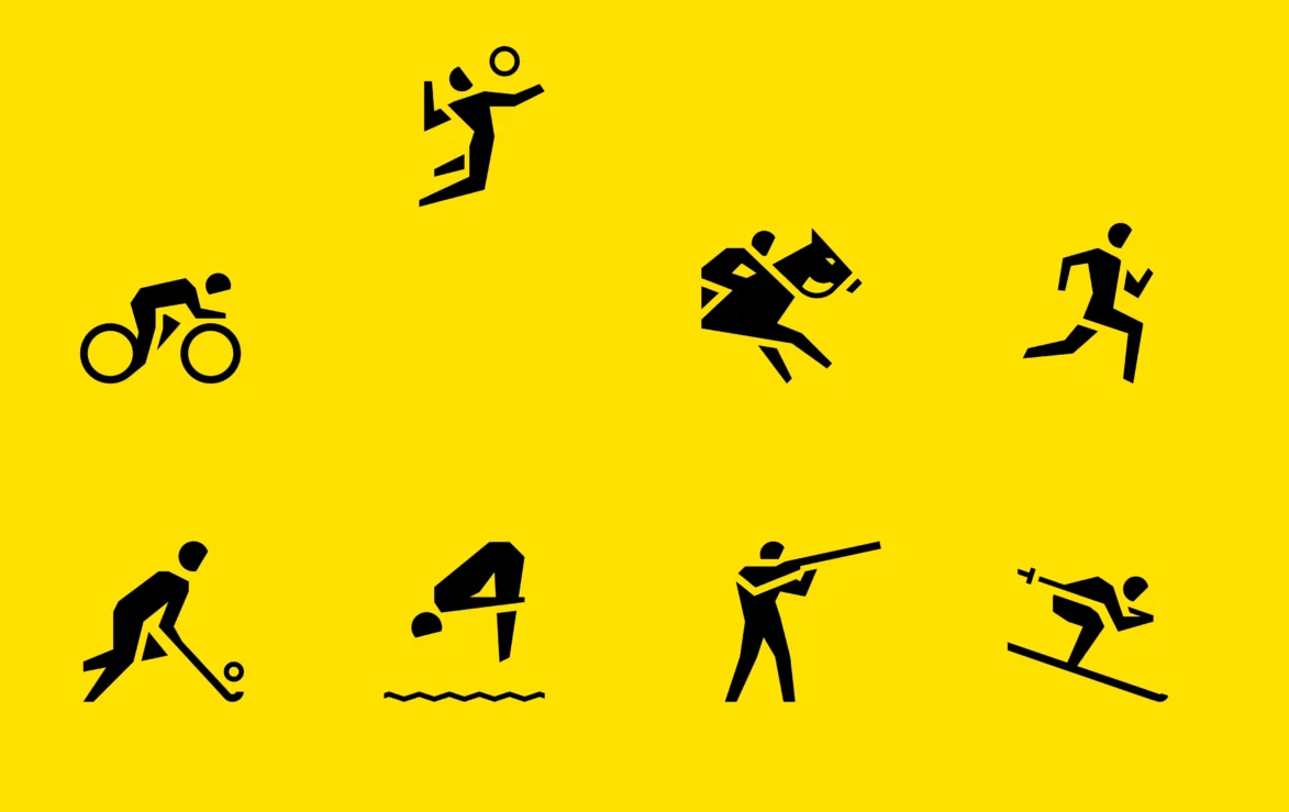
Breaking the rules
Icon systems are built to work inverted across colours on a site like the BBC. However, we quickly discovered that with sports where the object is represented, colour is so ingrained (you can not have a dark golf ball, or light bowls ball for example), that we needed to do it differently and build a light-on-dark, and dark-on-light version in unison.
Planning Unit evidently like a challenge. In collaboration with our UX design teams they crafted a coherent and accessible suite of over 180 icons which live at the heart of our Global Experience Language (GEL). Focused and personable, Planning Unit deliver without ego, yet with confidence.
Thanks to the team at BBC
Simon and David.

