
Salomon
Crafting the future of sports since 1947
Creating a new global identity for Salomon – the mountain sports company born in the French Alps and founded in 1947 by François Salomon.
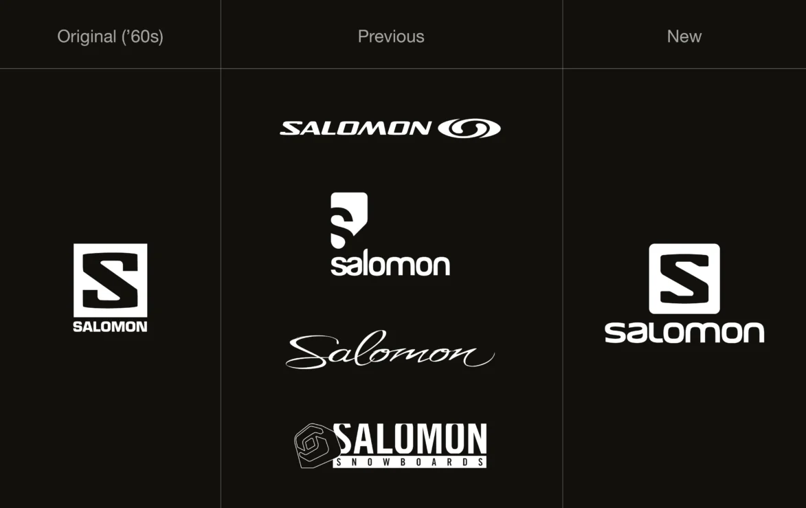
The Salomon brand had become disparate, with different departments commissioning their own logos. This was diluting brand recognition and the association with Salomon. Our goal was to unify all of its brands under one universal logo. From skiing, snowboarding, trail running, hiking, climbing and adventure racing, to products, marketing, promotional materials and retail environments.
Heavily rooted in passion for sports progression, product development, quality and craftsmanship, we created a new logo that is both considered and incorporated all of their core values.
Brand consolidation
Salomon stands strong with a singular identity and we worked closely with them to build this. The logo had to feel gender neutral, inclusive, forward thinking, performance driven and straight to the point.
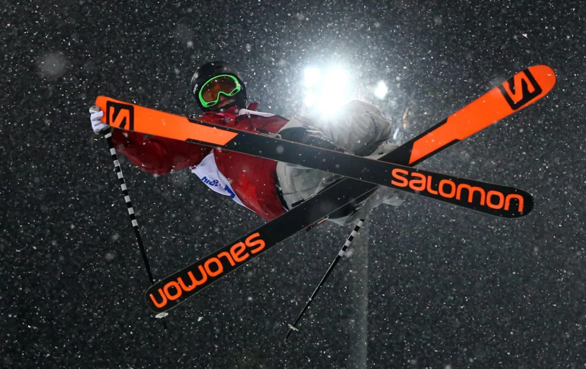
The letter S forms the new expression of Salomon’s heritage and the progressive step towards the future (the starting point being the original heritage S logo loved so much by the core Salomon fanbase).
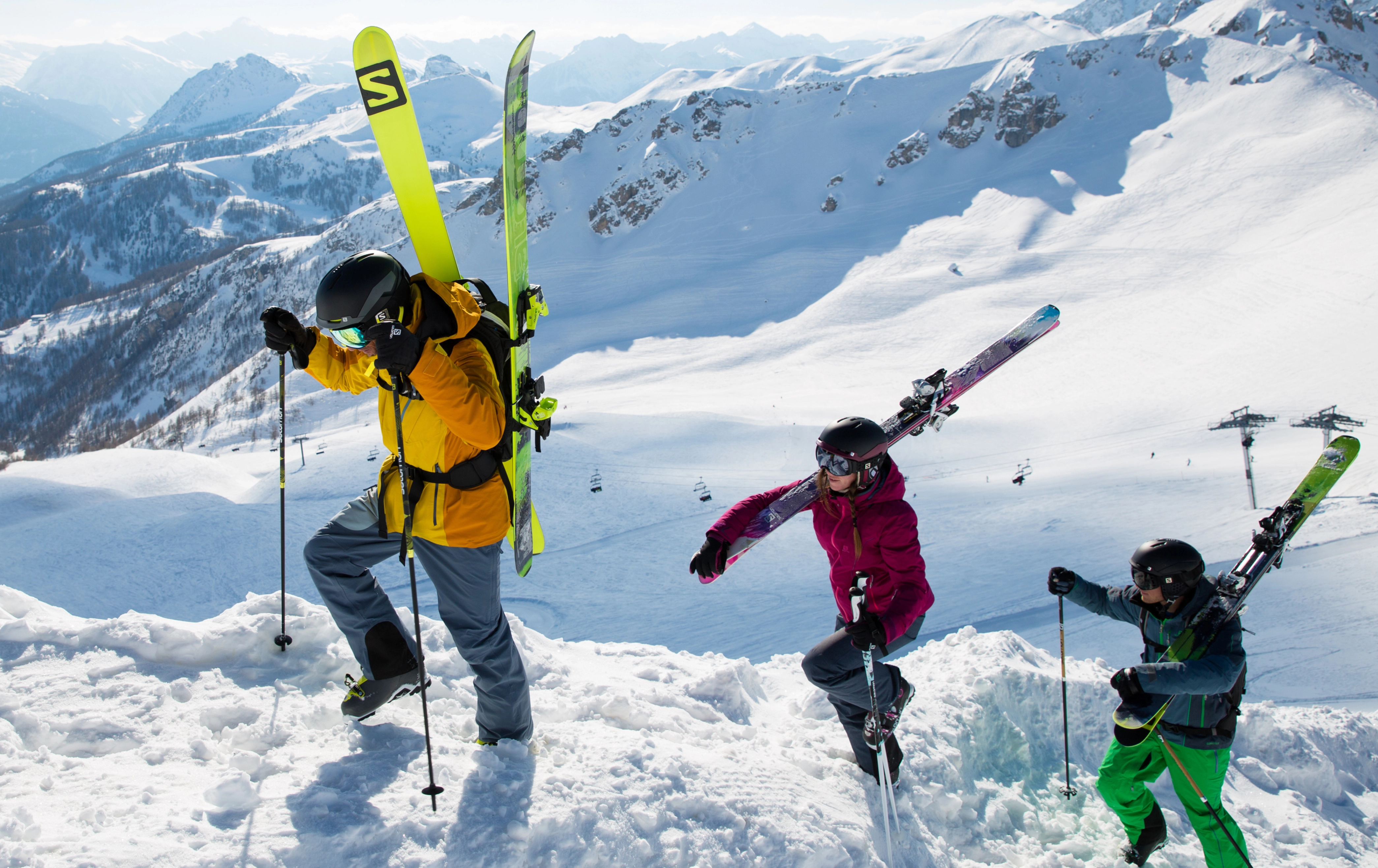
All terrains, all materials
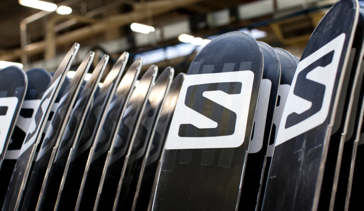
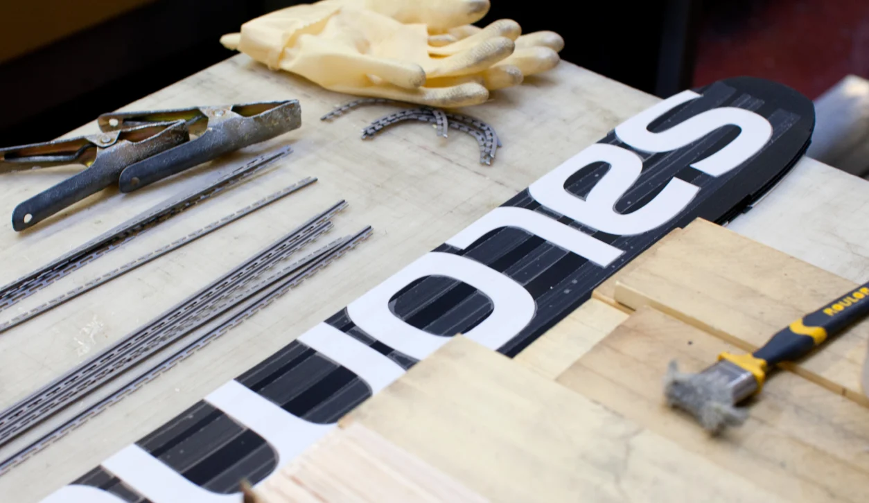
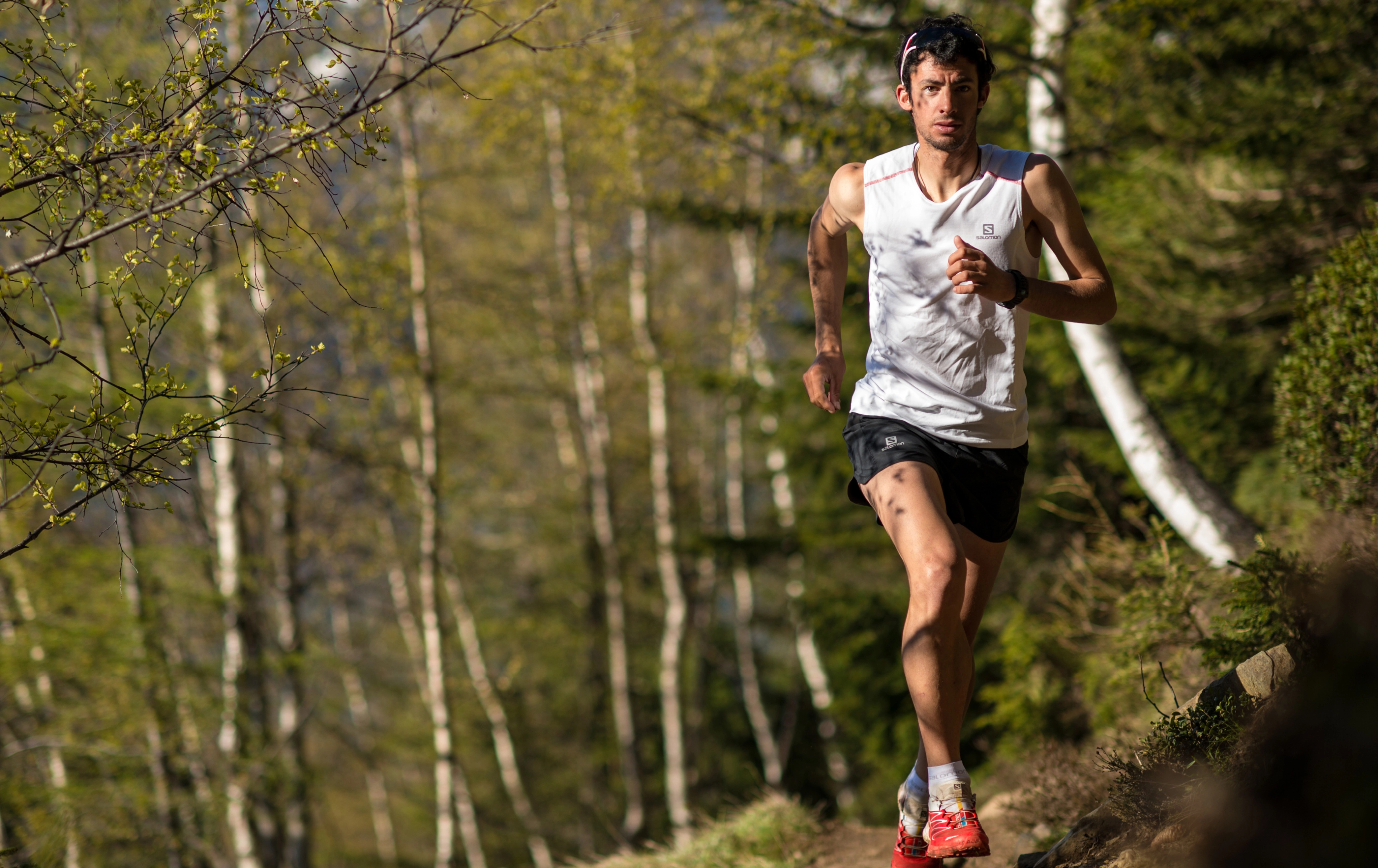
We stress tested the logo to ensure it works perfectly across all touchpoints, and with all the production methods required across Salomons’ broad range of products.
Identity in action
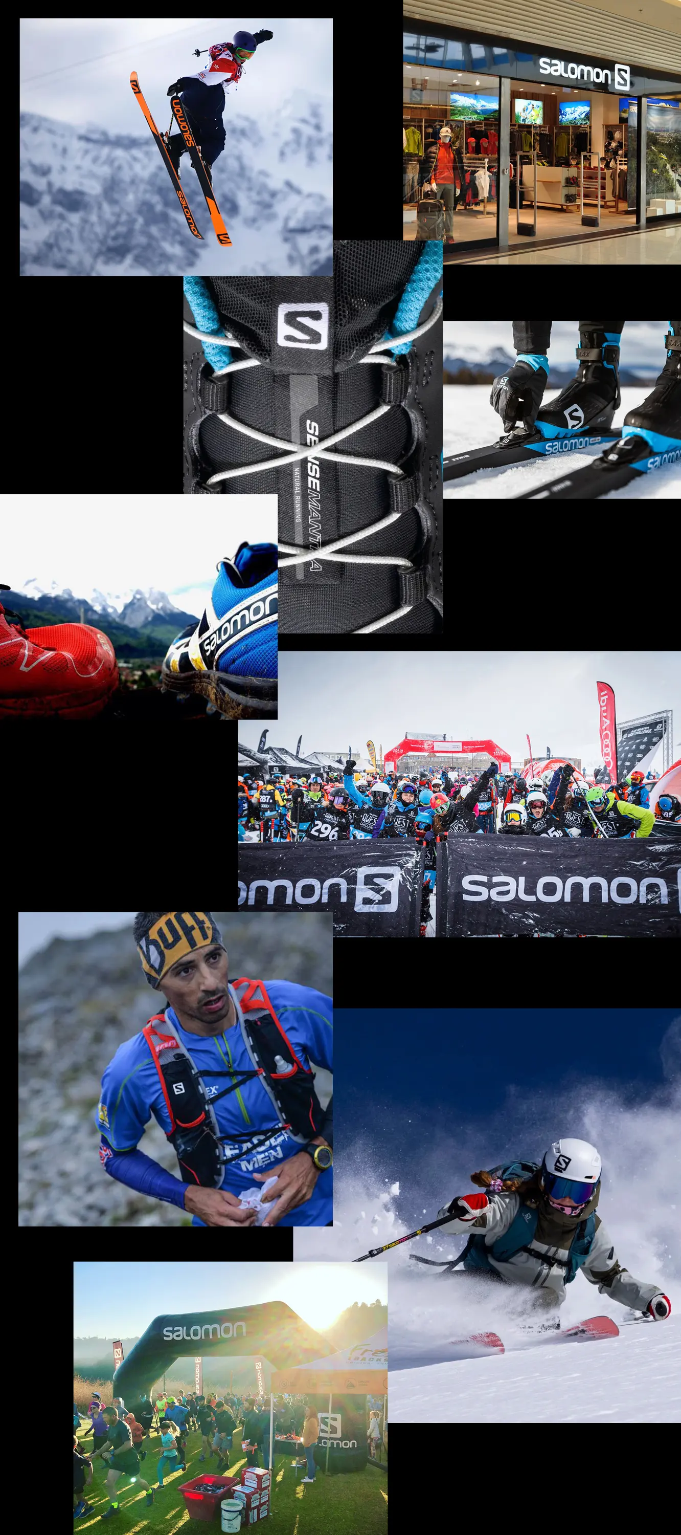
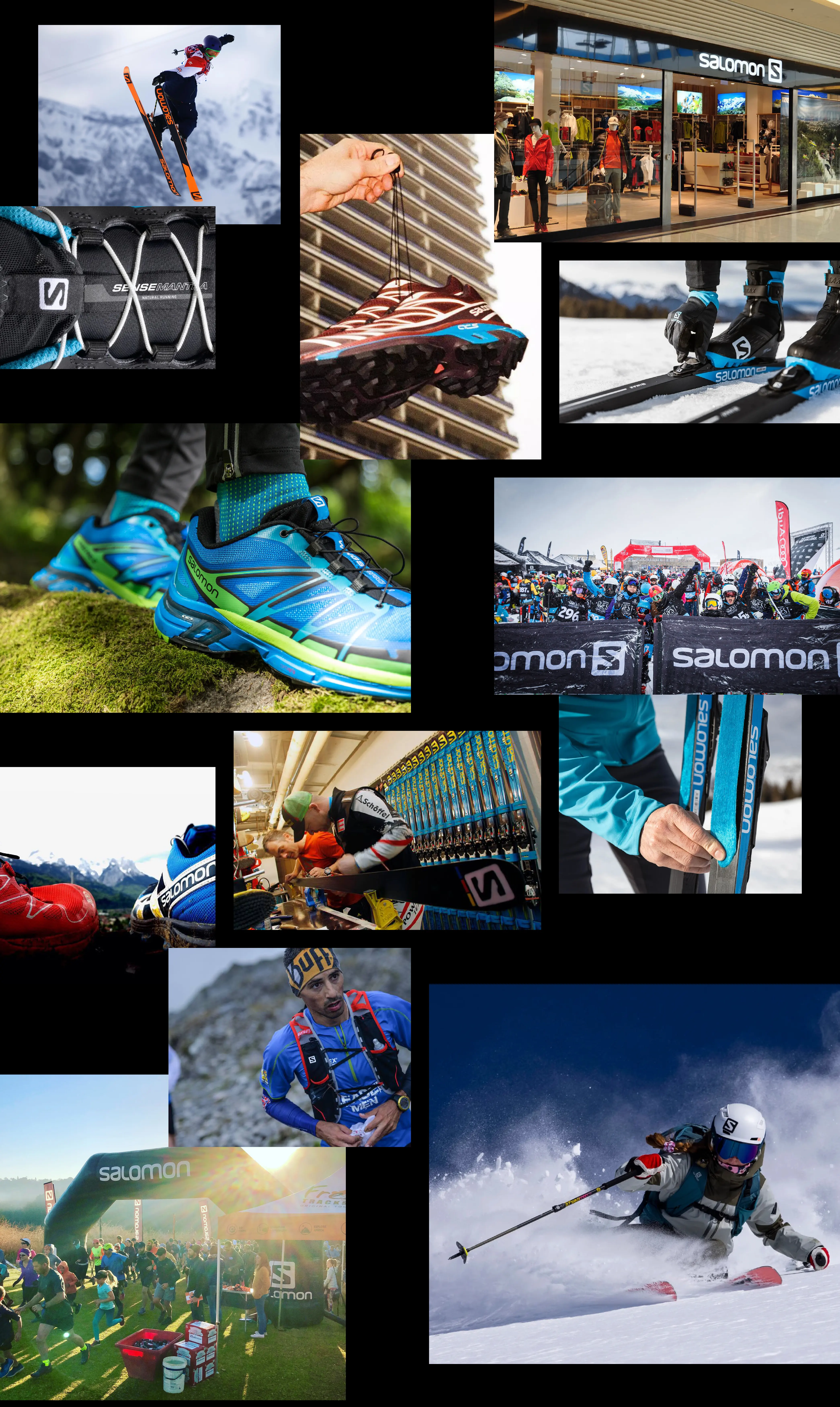
Designed for clarity
The ‘S’ is designed to work perfectly both ways around, ensuring it can never be used incorrectly. This flexibility is essential for a sportswear brand focused on clarity and performance.
Rebranding a global outdoor icon with nearly 70 years of deeply engrained history like Salomon is no small task. Add to that replacing a logo created by one of the most prolific graphic designers of all time and you have the project which Planning Unit took on and delivered with care and elegance. But working with Planning Unit is most importantly fun. I don’t think I ever came out of a meeting or call with those guys without a positive feeling and a smile on my face.
A big shout out to:
Niclas and Hal.
